
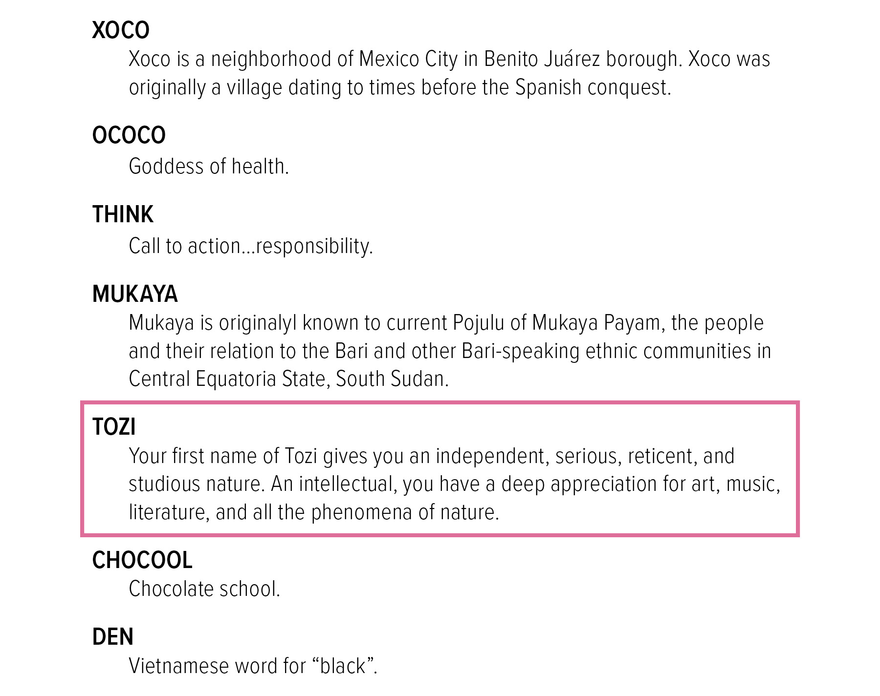
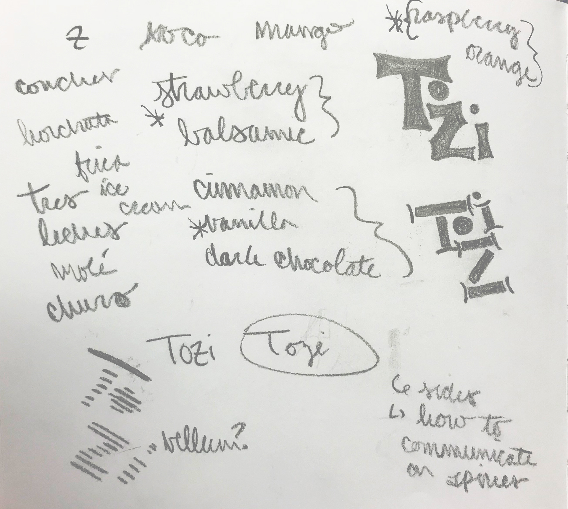
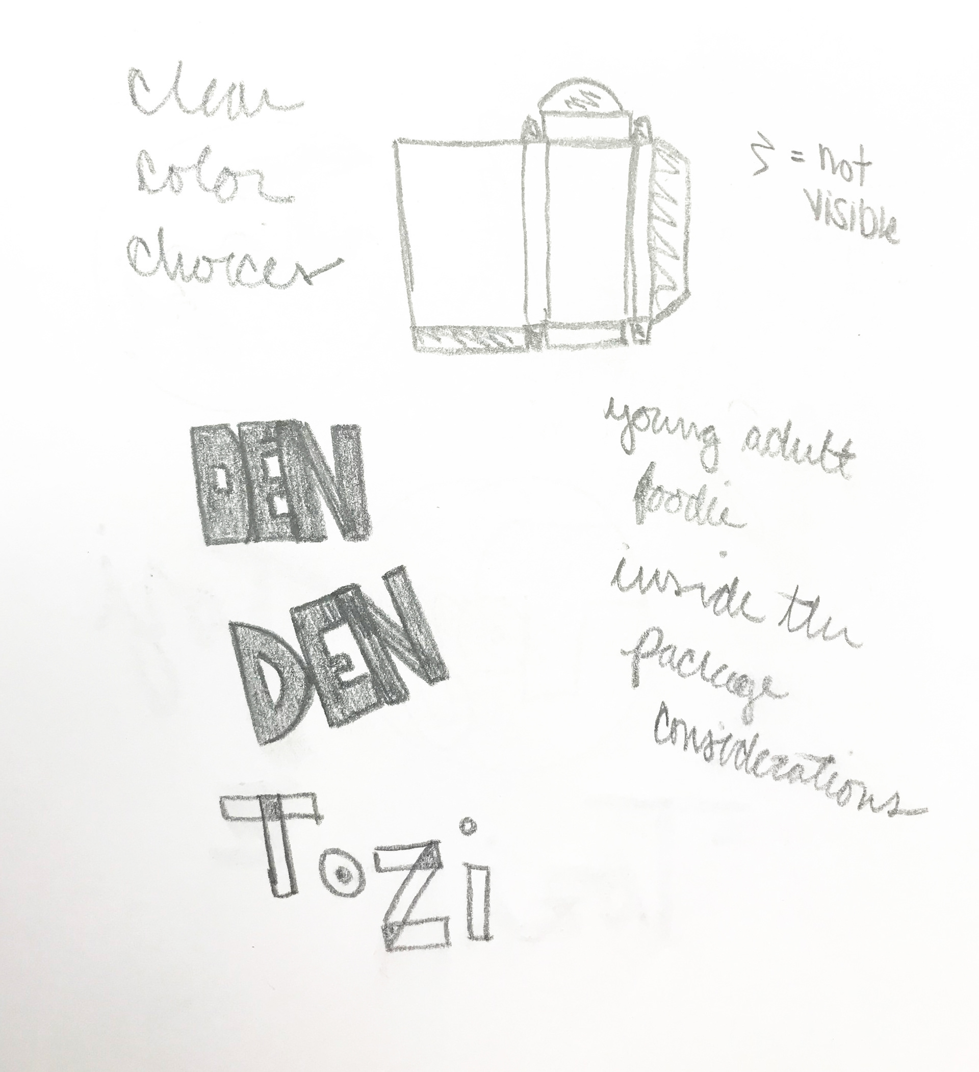
We were initially given a list of name options to choose from. After some initial sketching based on a couple of the options, like Den, I decided the name “Tozi” and the focus on nature would create a lot of options for type.
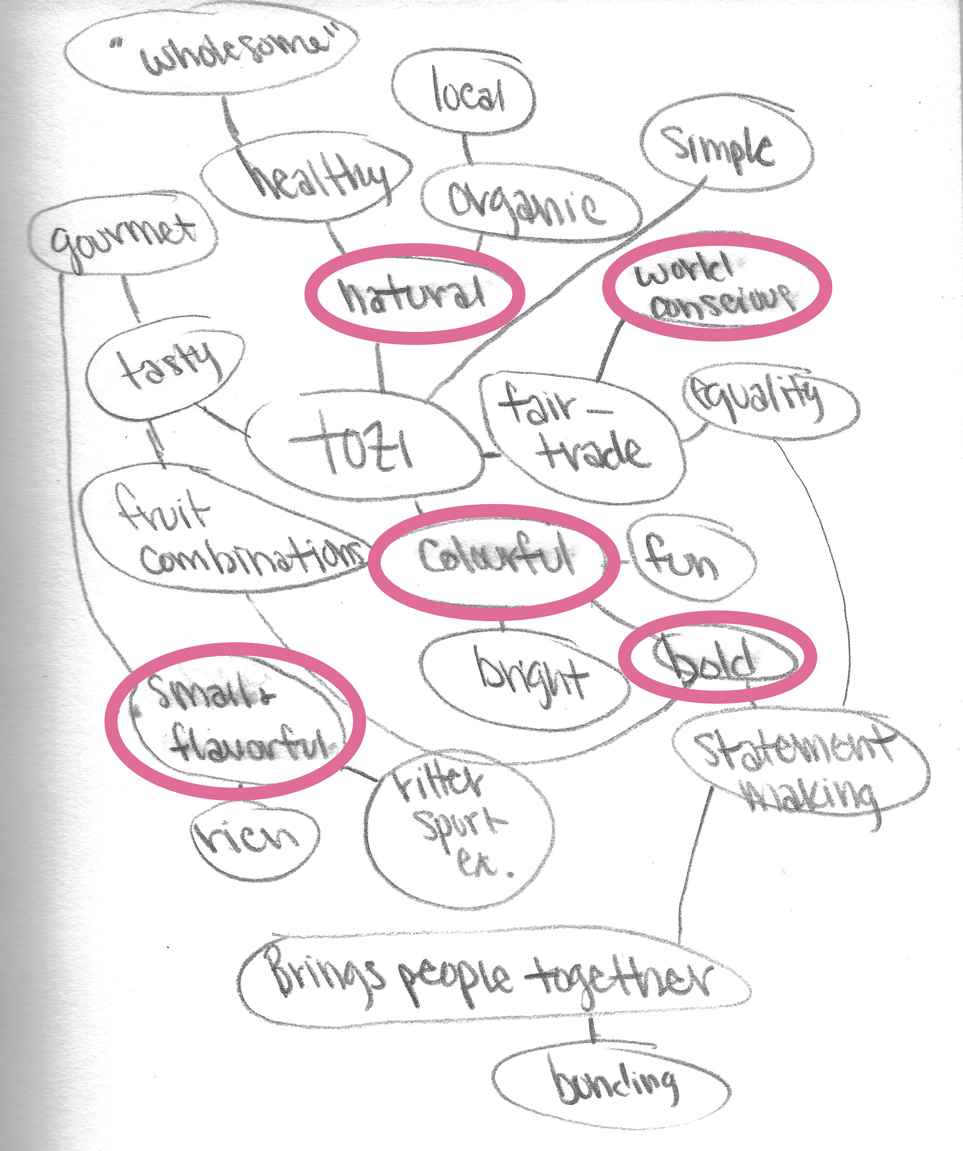
Based on the name Tozi, I began thinking through how this brand could come to be. That included thinking about flavors, how would the brand present itself, and what the brand would stand for. This lead to creating the overall brand story. Who is Tozi?
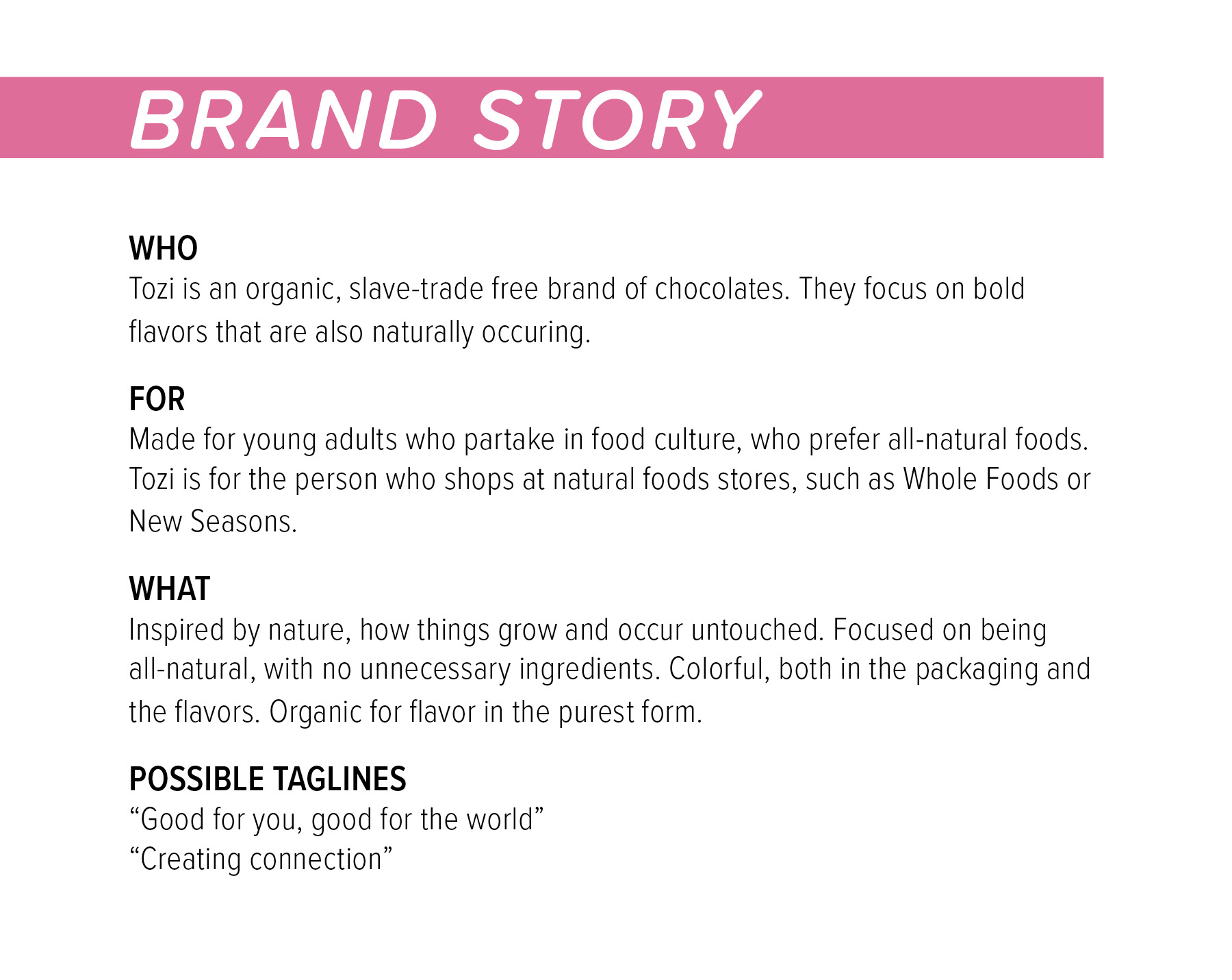
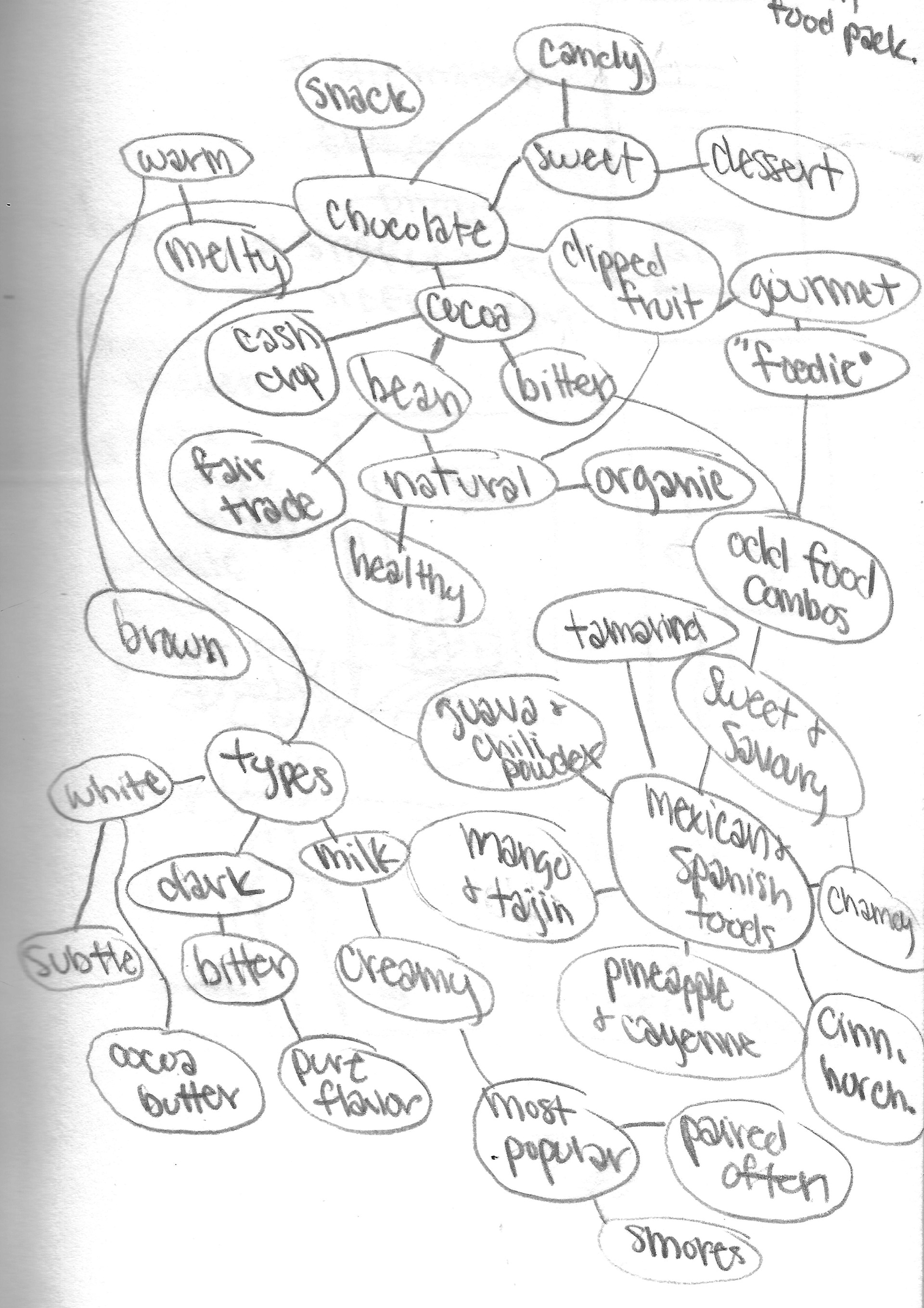
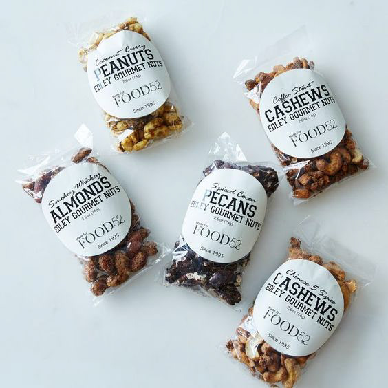
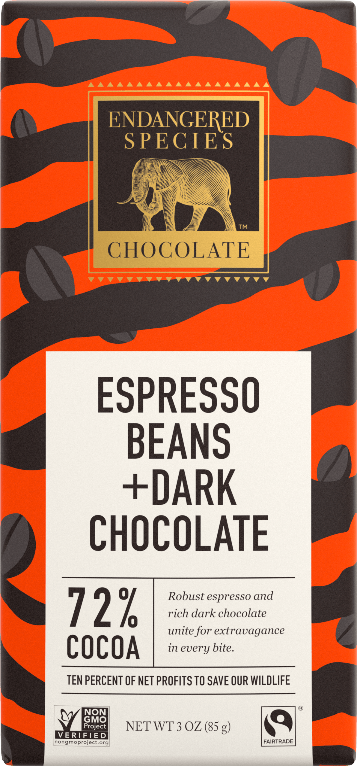
Coming up with a brand story included doing research on the market, other natural chocolate brands, and the visual language they use.
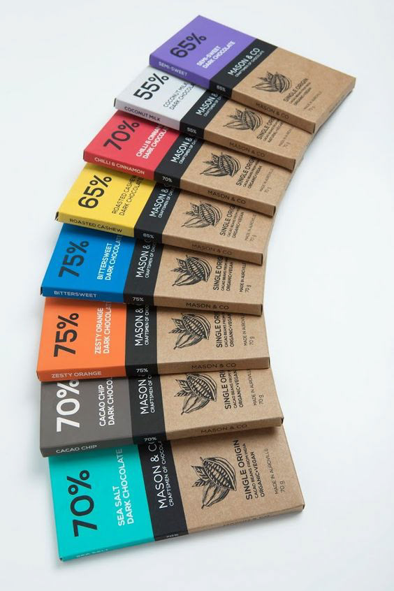
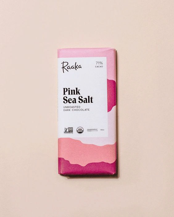
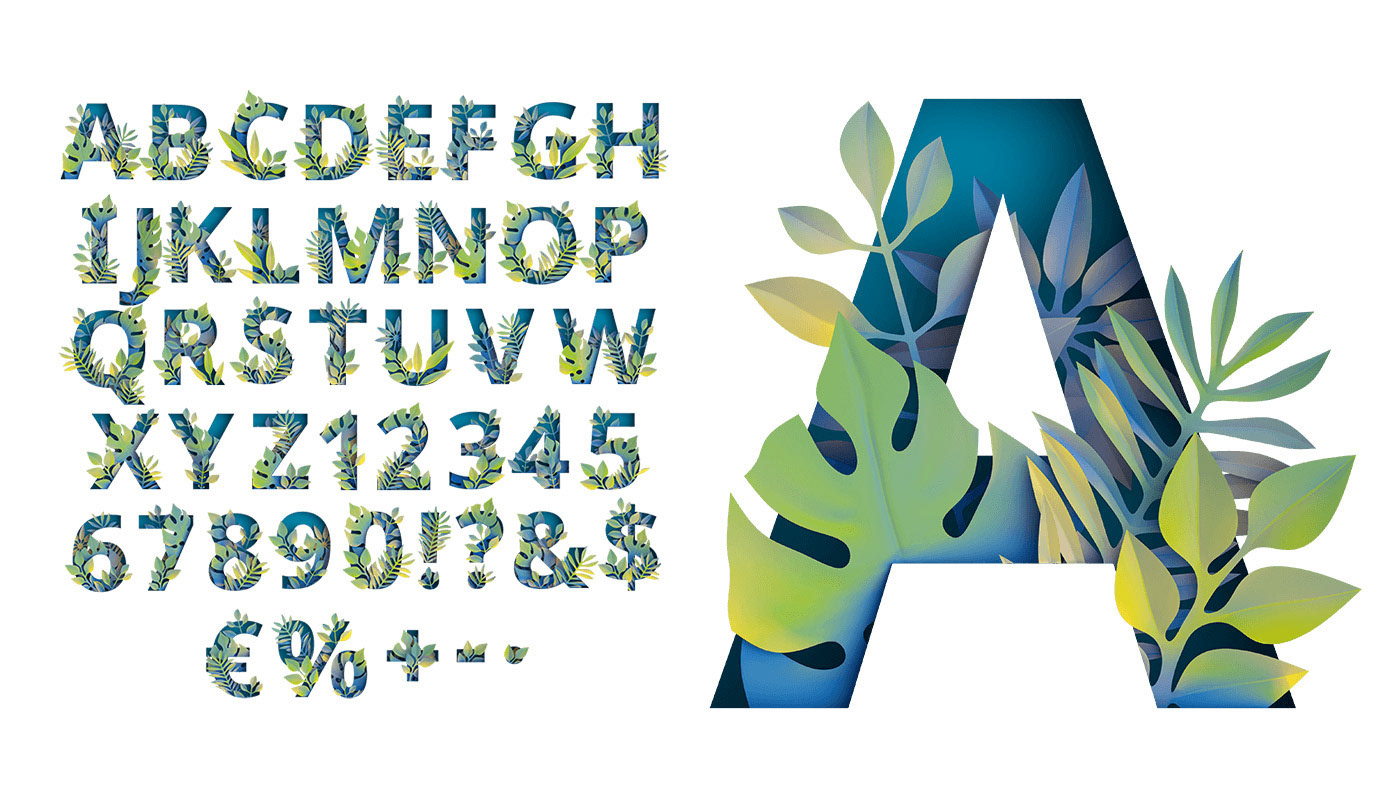
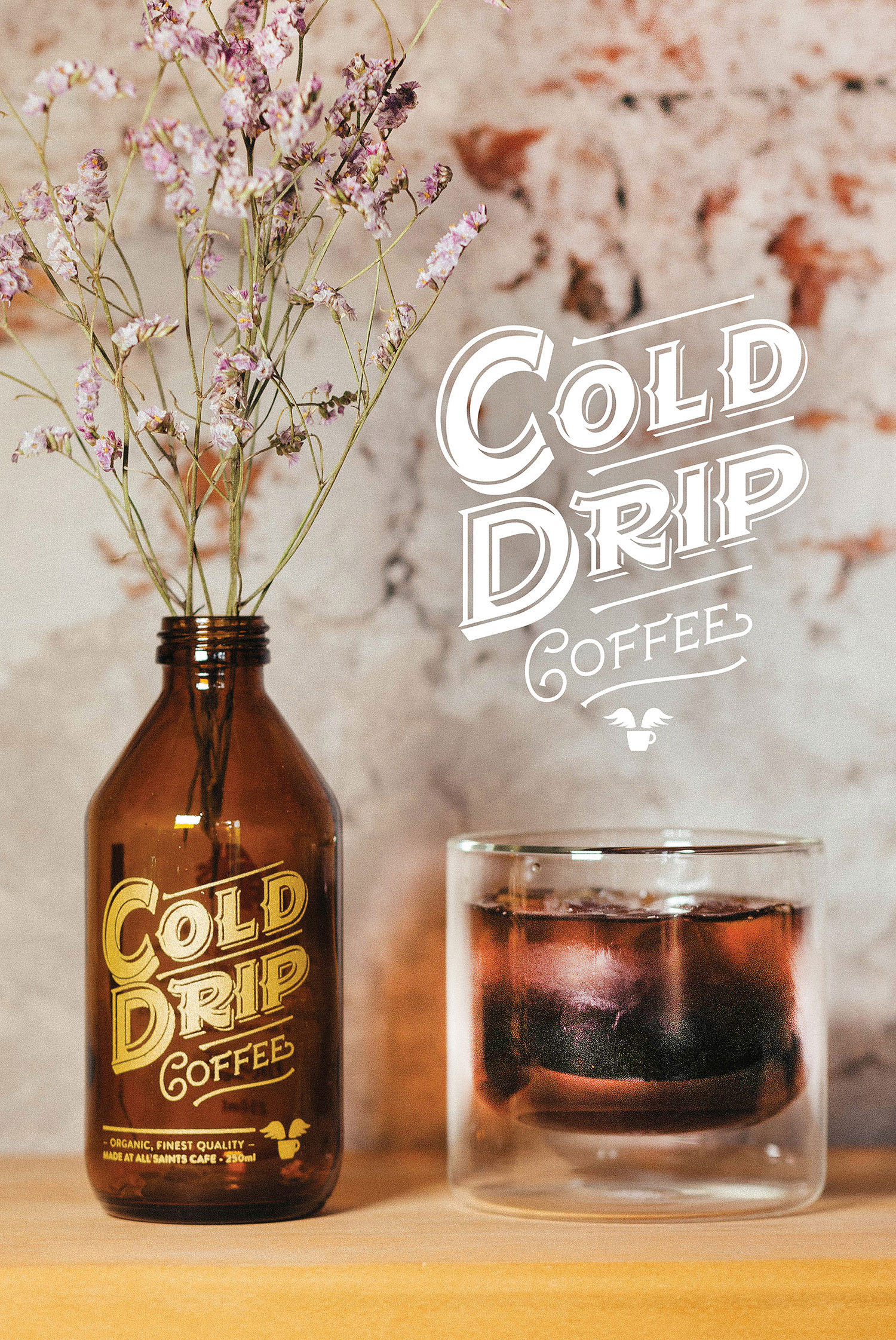
Next came visual inspiration. Inspiration was pulled from a multitude of sources. Much of the focus for visuals was put on the portrayal of botanicals and expressive typography. Use of color, as well as spacing, was also given consideration.

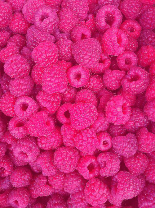
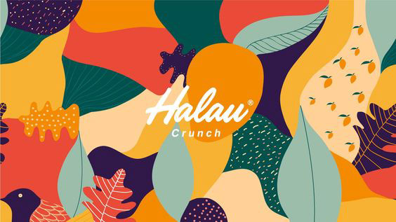
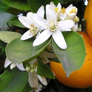
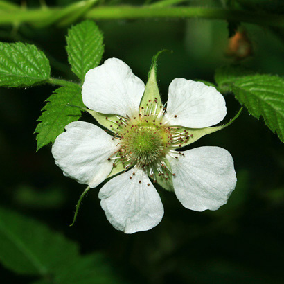


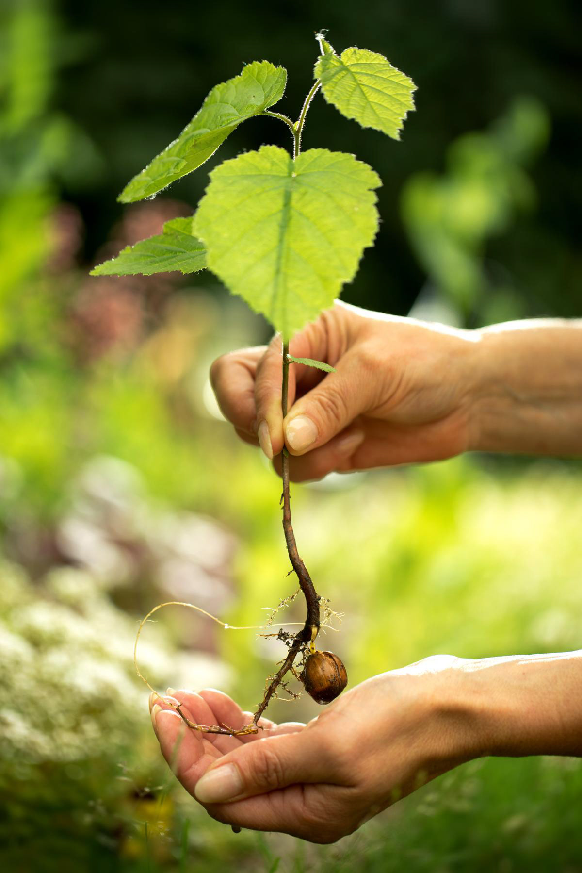
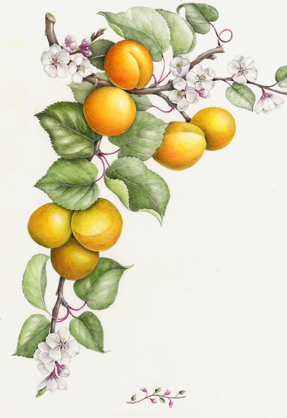
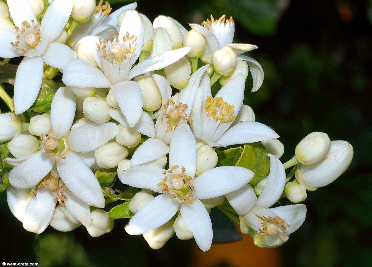
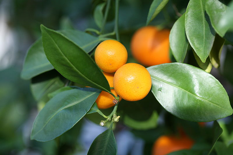
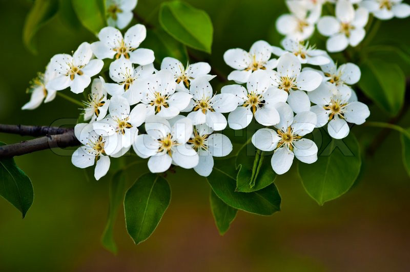
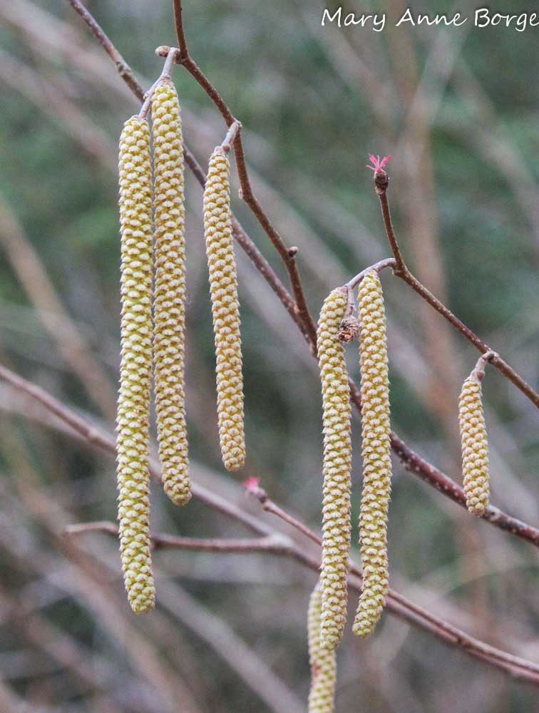
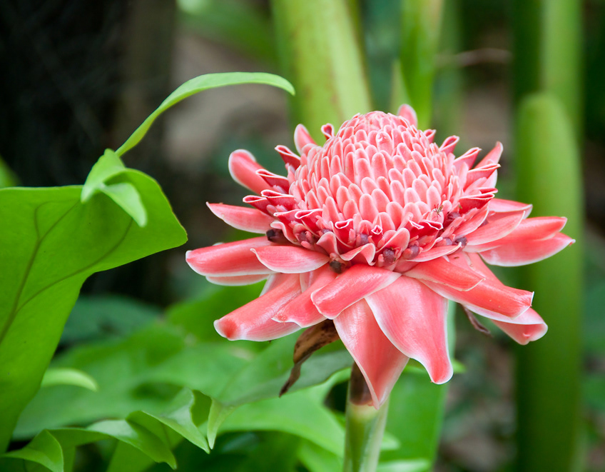
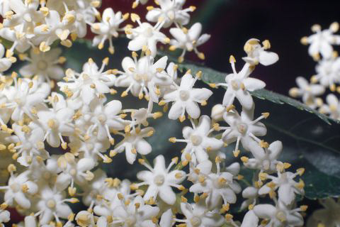
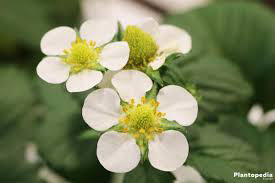
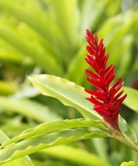
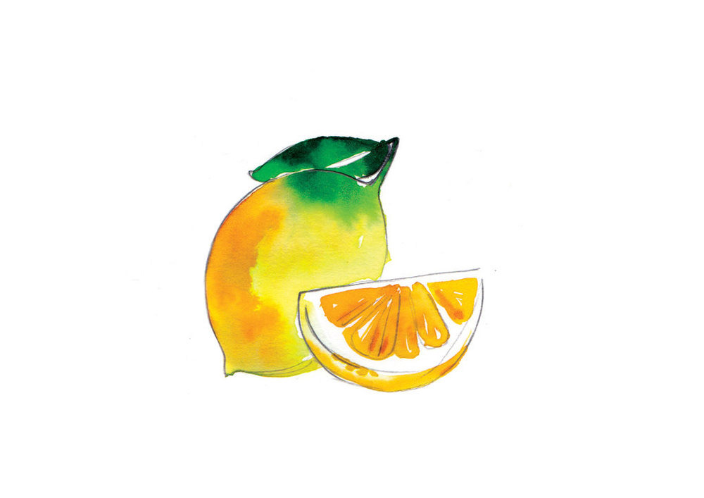
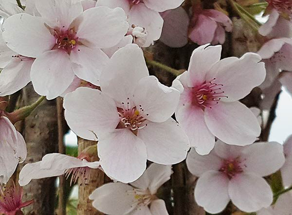
I then spent time looking at the form of fruits, how they naturally occur, as well as their flowers and leaves. Further imagery was gathered of botanical drawings to see what has been done before. What characteristics are captured?
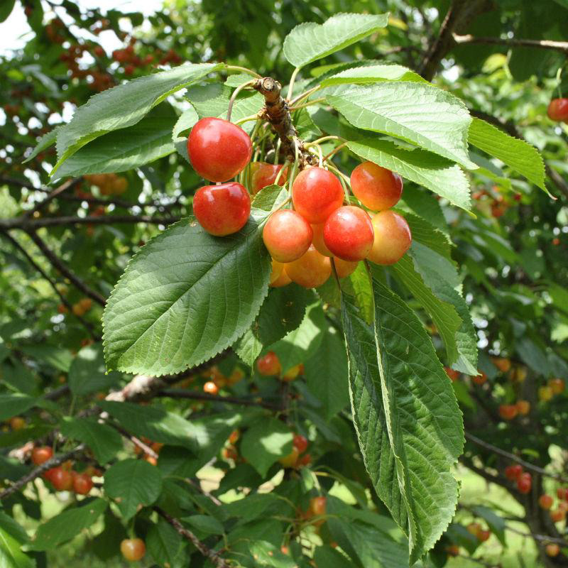
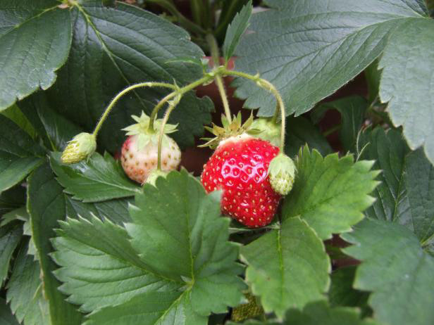

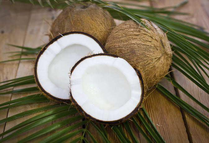
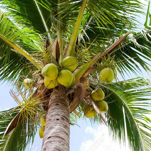

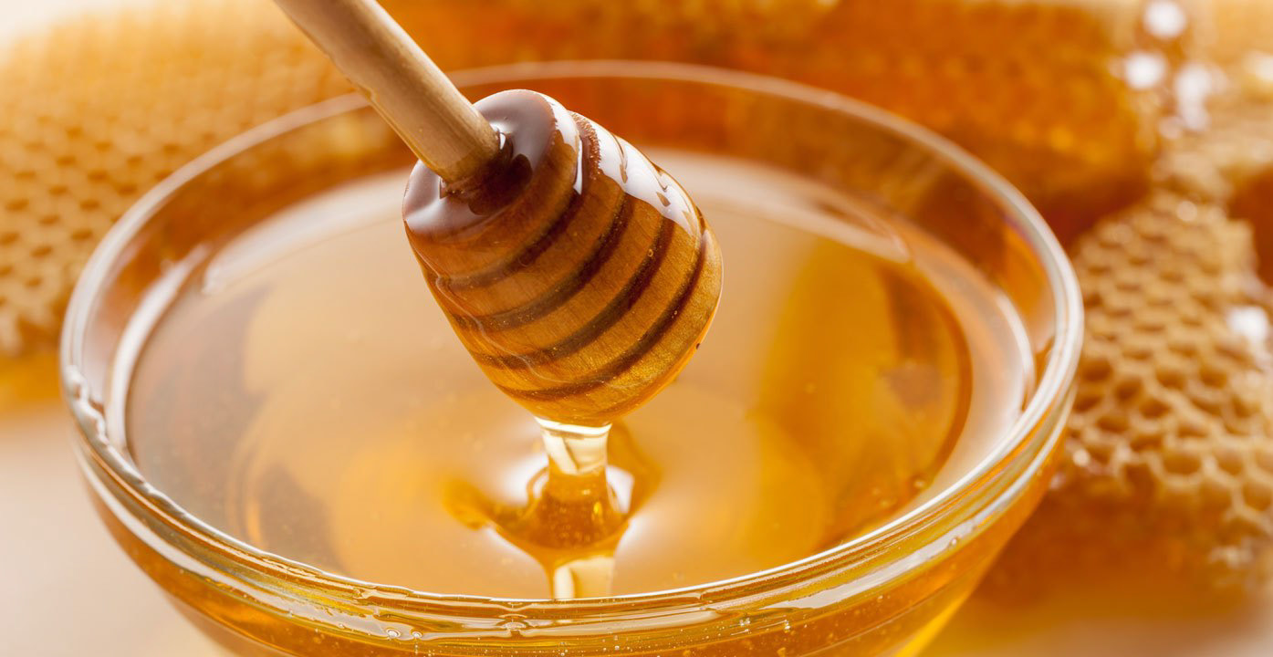
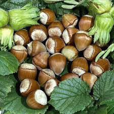

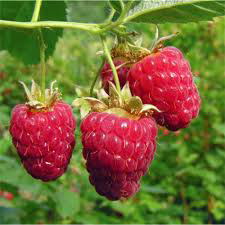

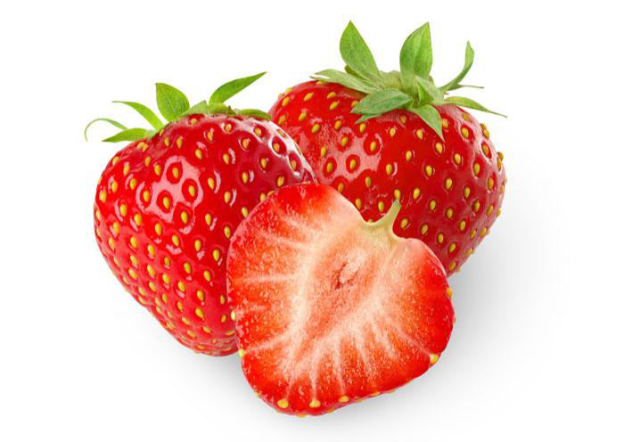
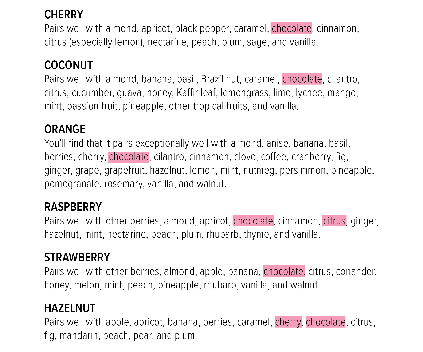
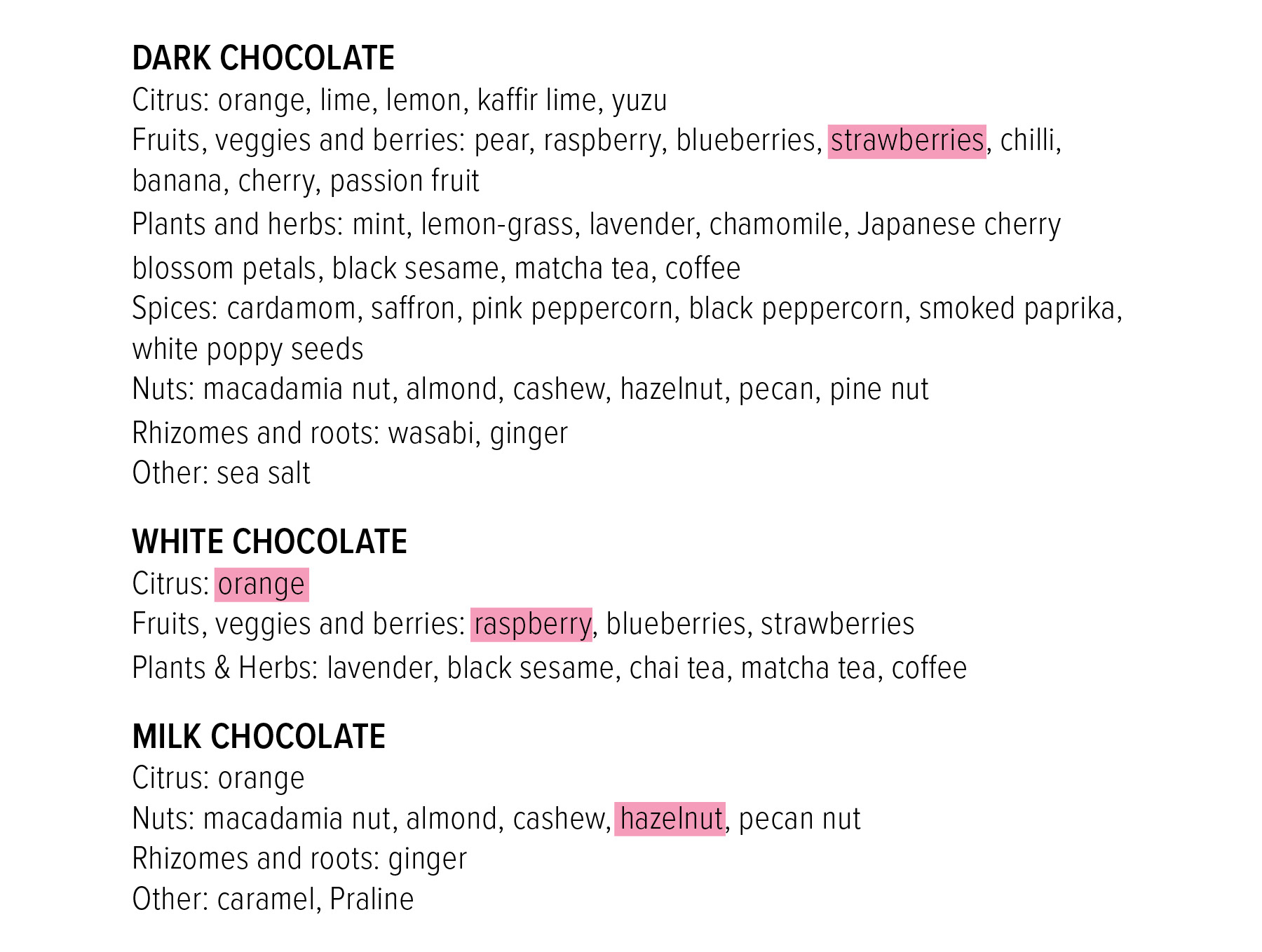
Next was research on flavor pairings, what fruits go well with chocolate as well as each other. I referenced a fruit Flavored cocktail guide as well as a chocolate goes well with guide to make final decisions.
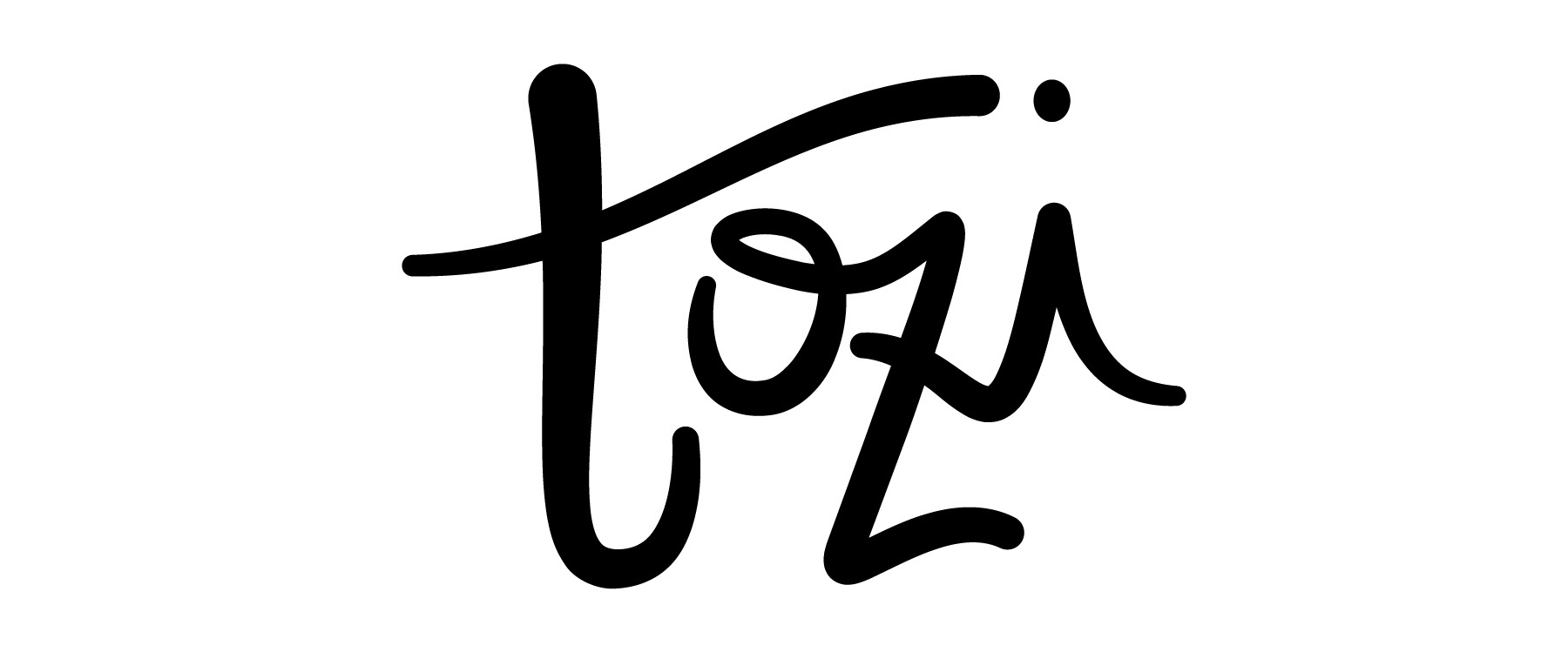
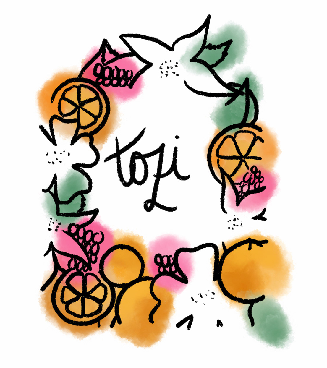
Because of the focus on “all the phenomena of nature” I wanted the word mark to be flowing, organic, with a roundness to it to emphasize the natural ingredients used in the product.
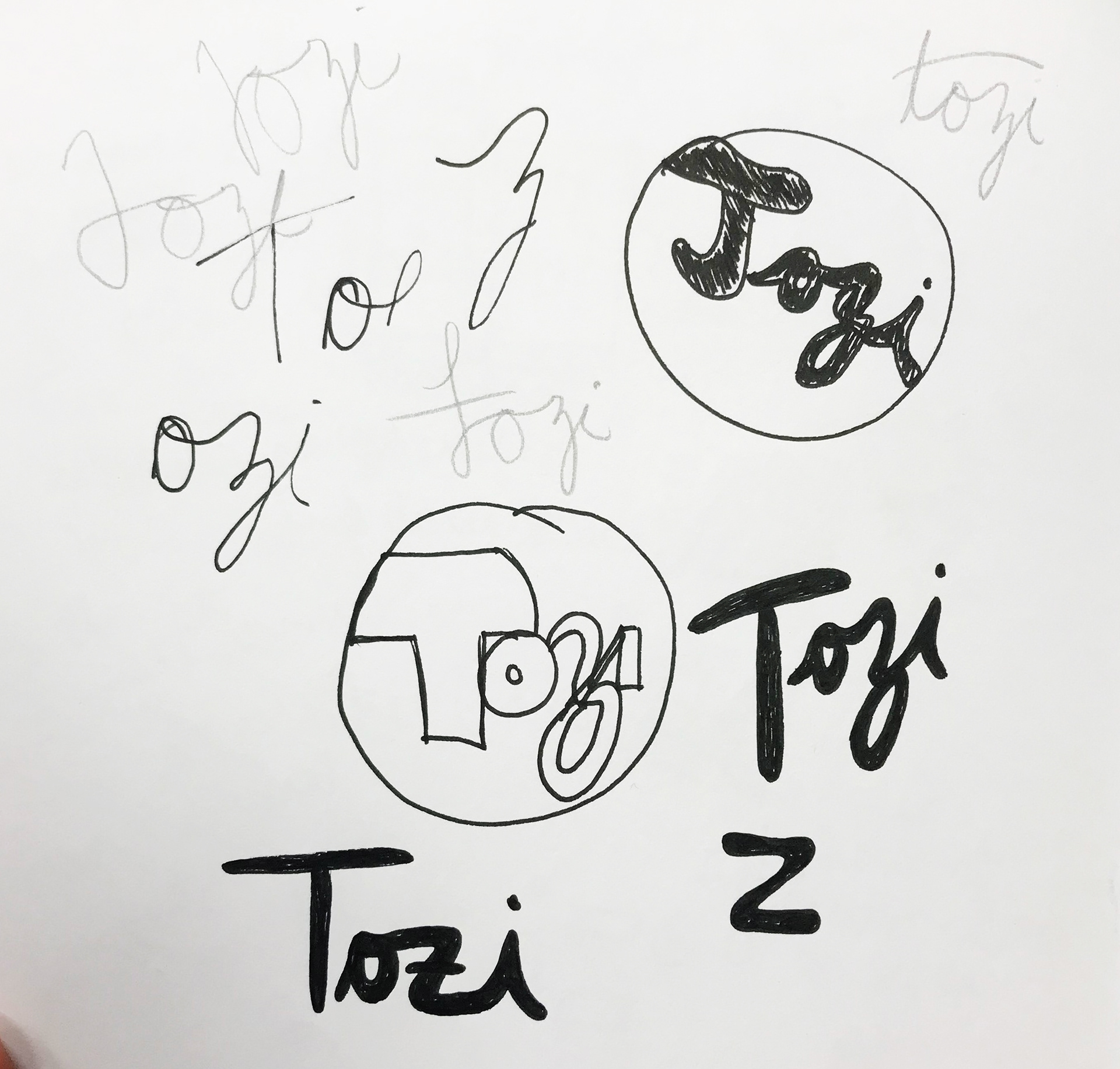
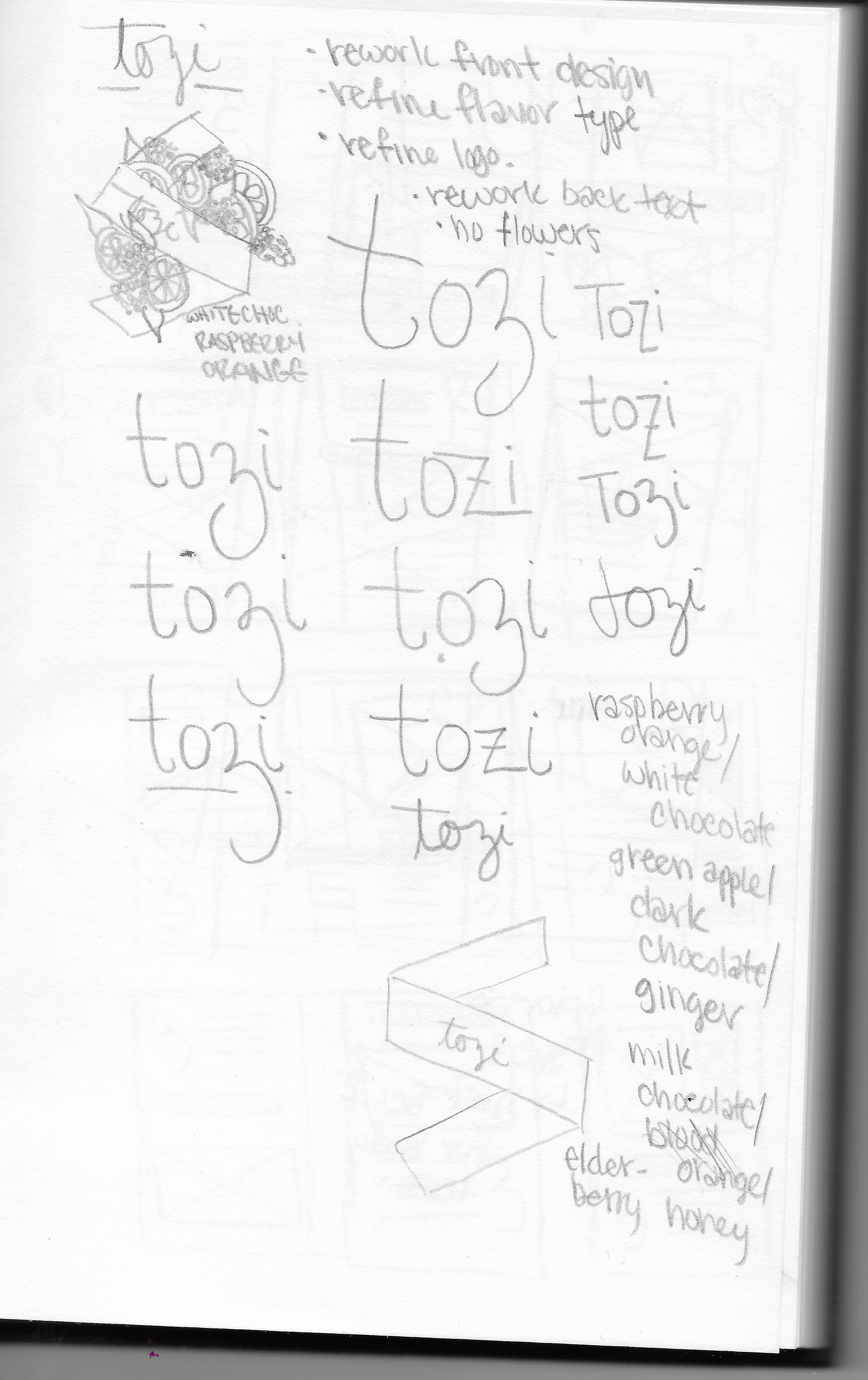
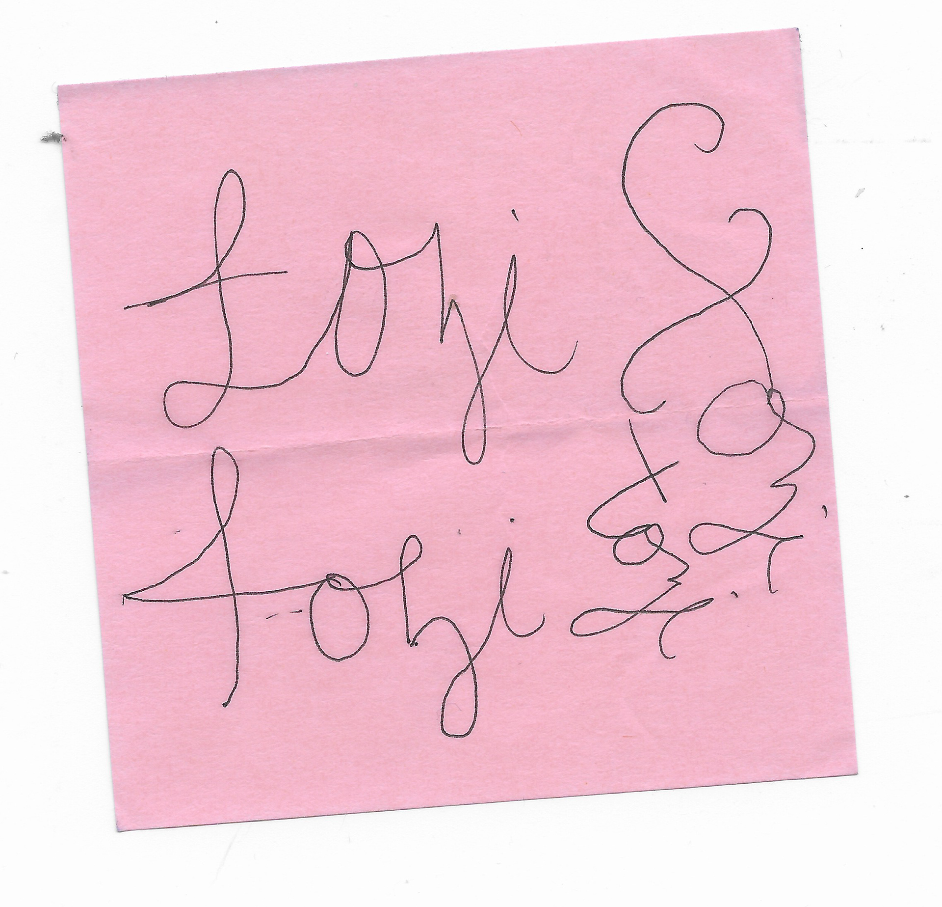

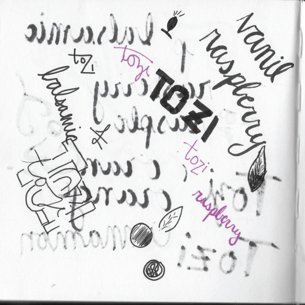
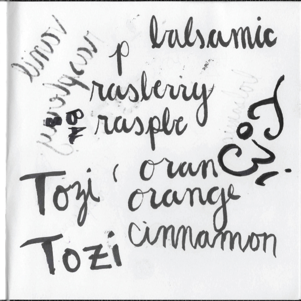
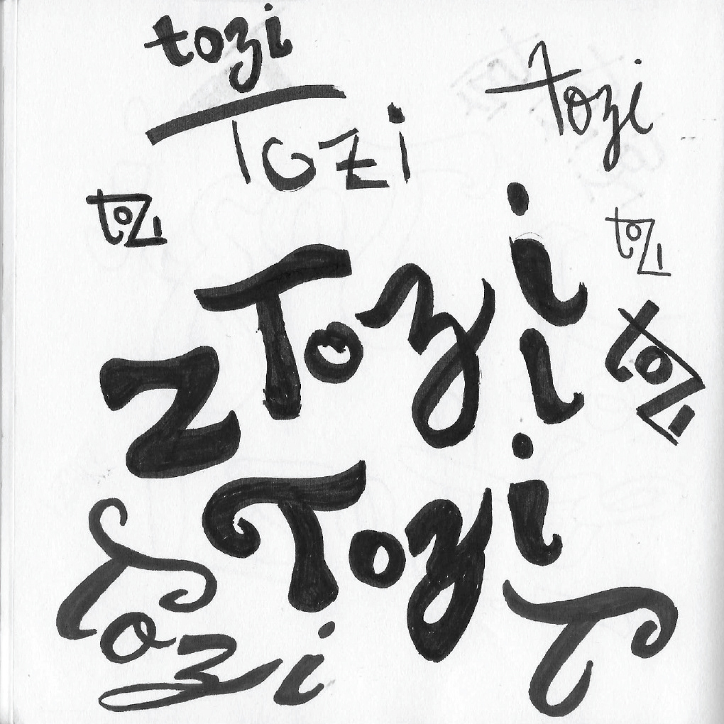

A combination of handlettering and exisiting typefaces were used to find a balance between the energy that exists in nature while still being effective at communicating the gourmet flavors of Tozi chocolates.
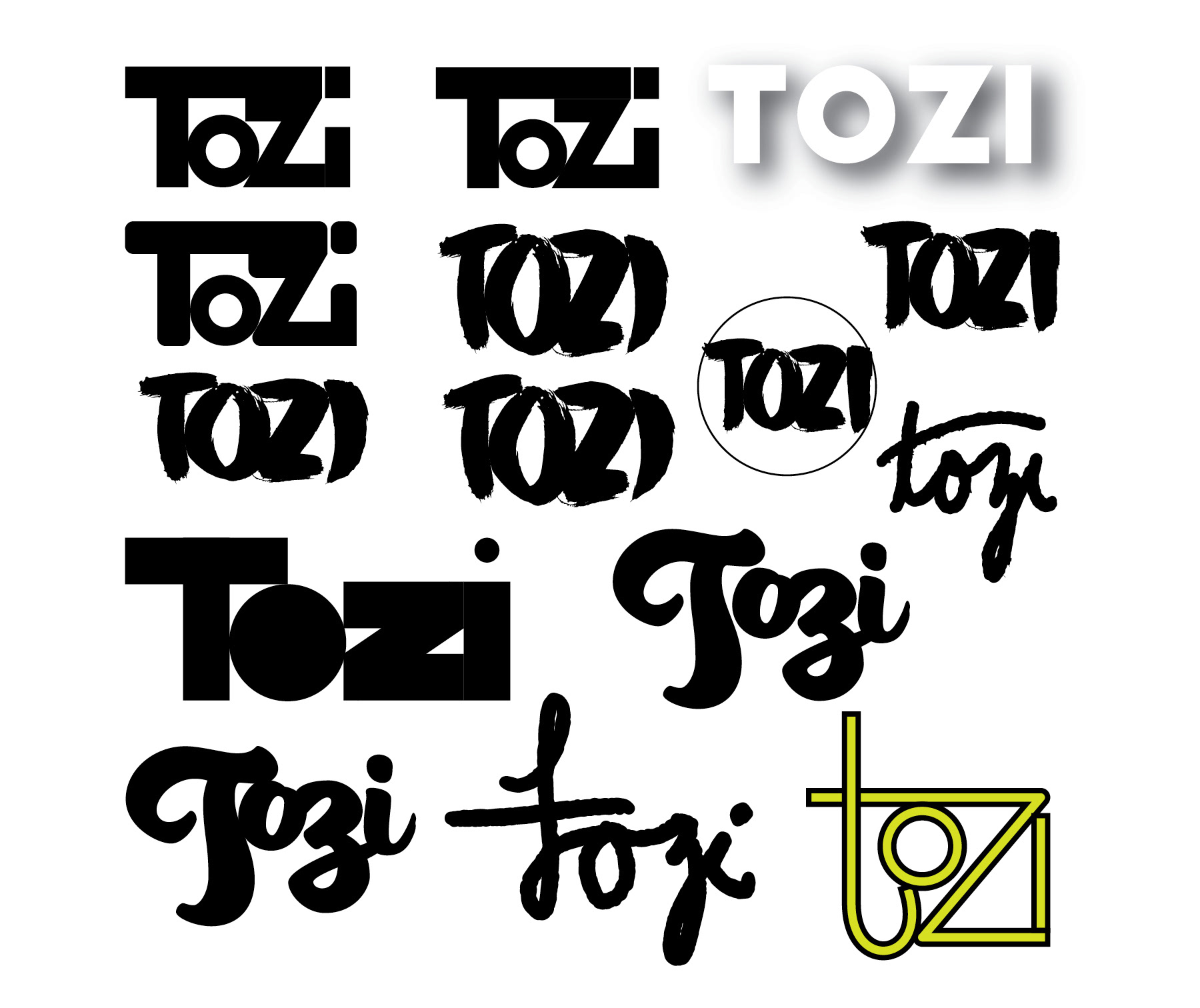
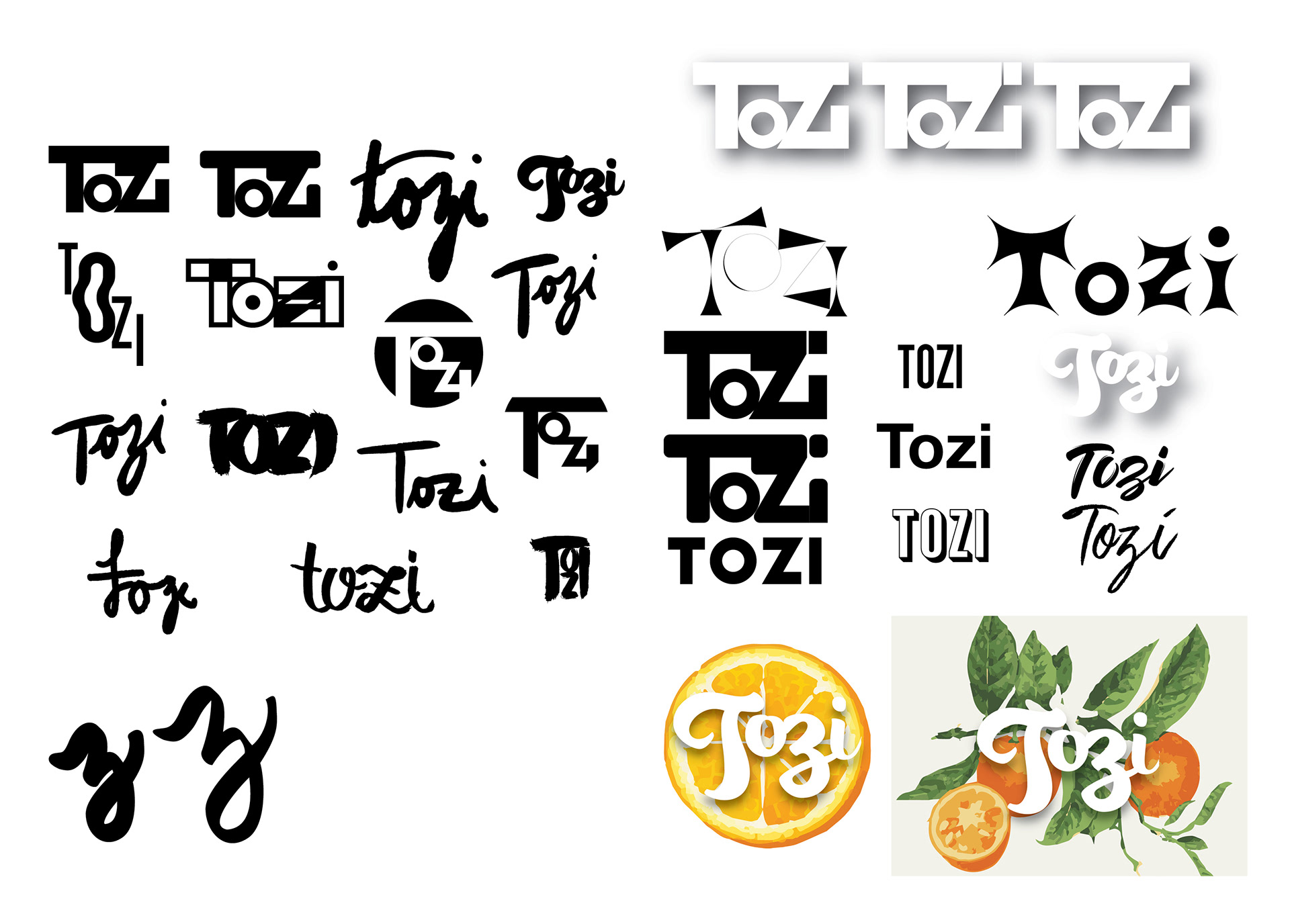
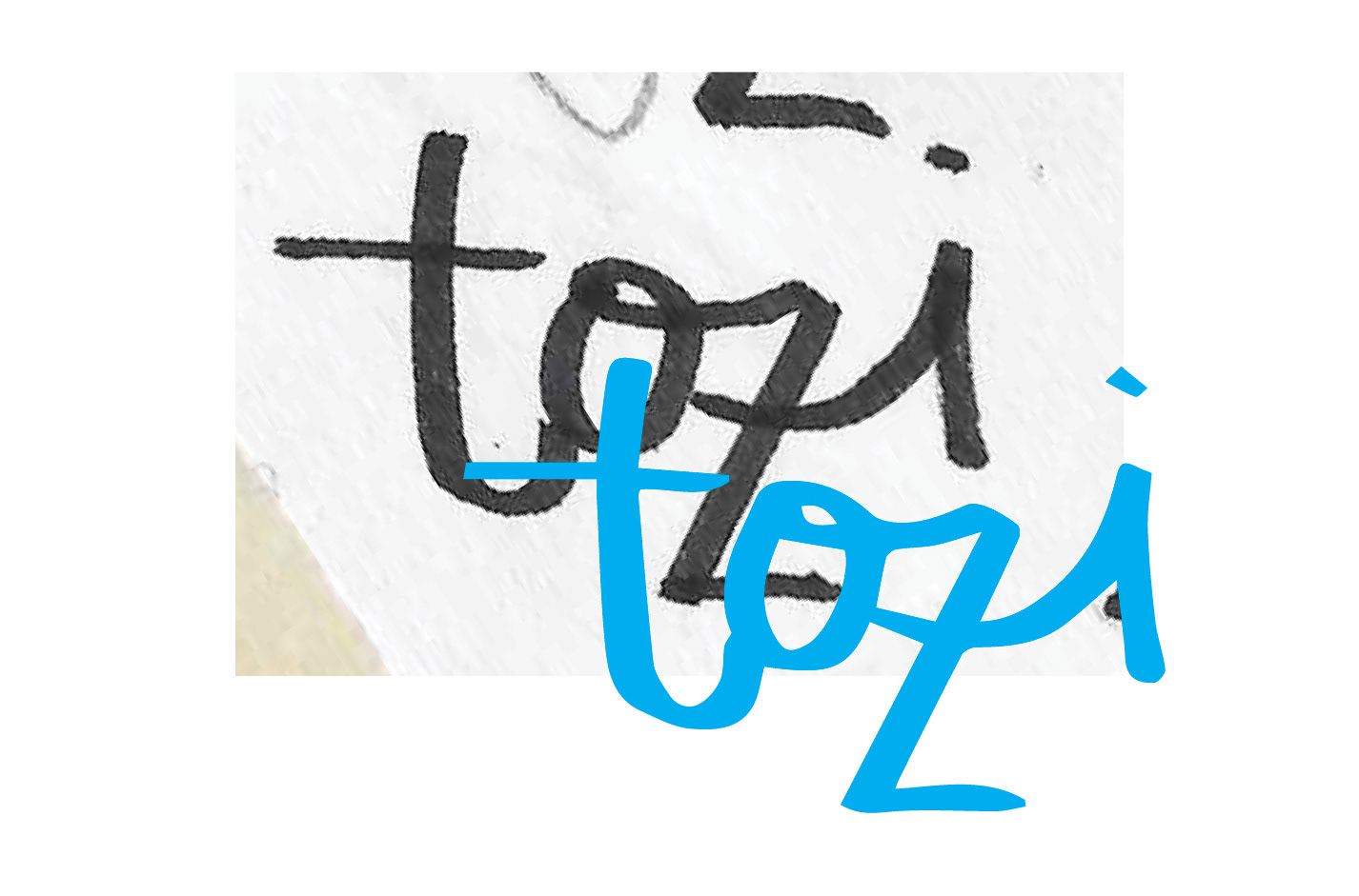
Through feedback received during critiques, these next image was chosen as the strongest wordmark idea. Based on the initial sketches of this mark, the Illustrator image-traced version (in blue) was used as a rough estimate of what the final wordmark would look like.

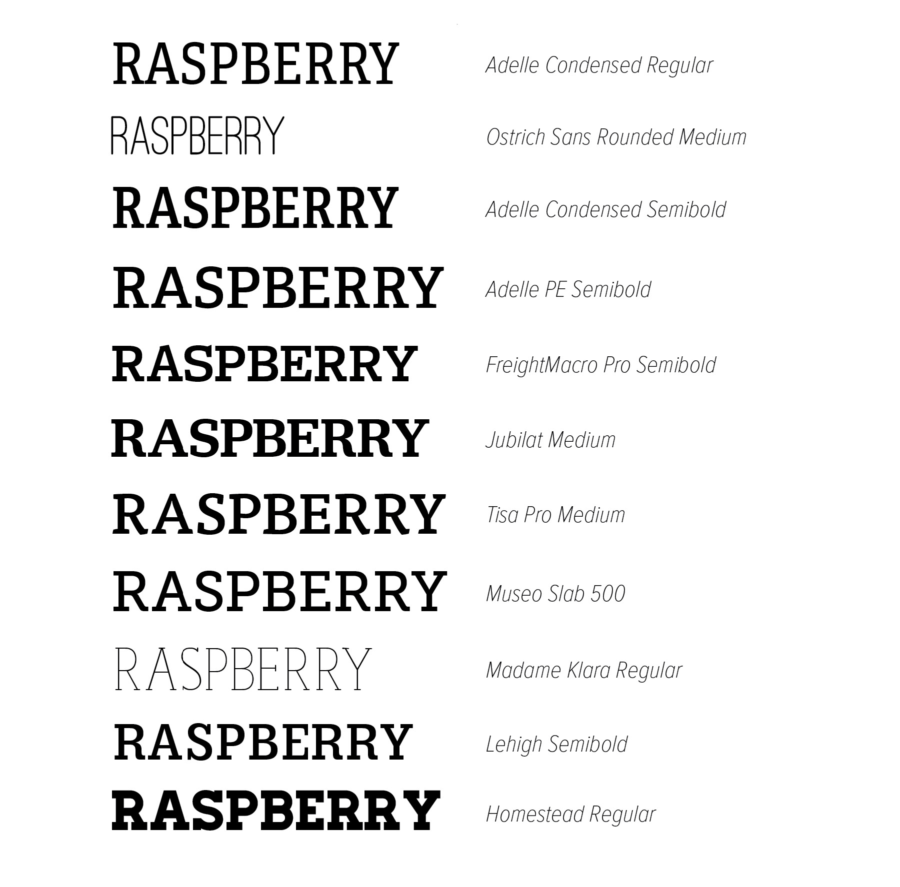
Initially, I was drawn to pairing the wordmark with a slab serif type for secondary text. Due to the stylized nature of the wordmark, this created a design that was too busy so I decided on a sans serif to pair with the wordmark.
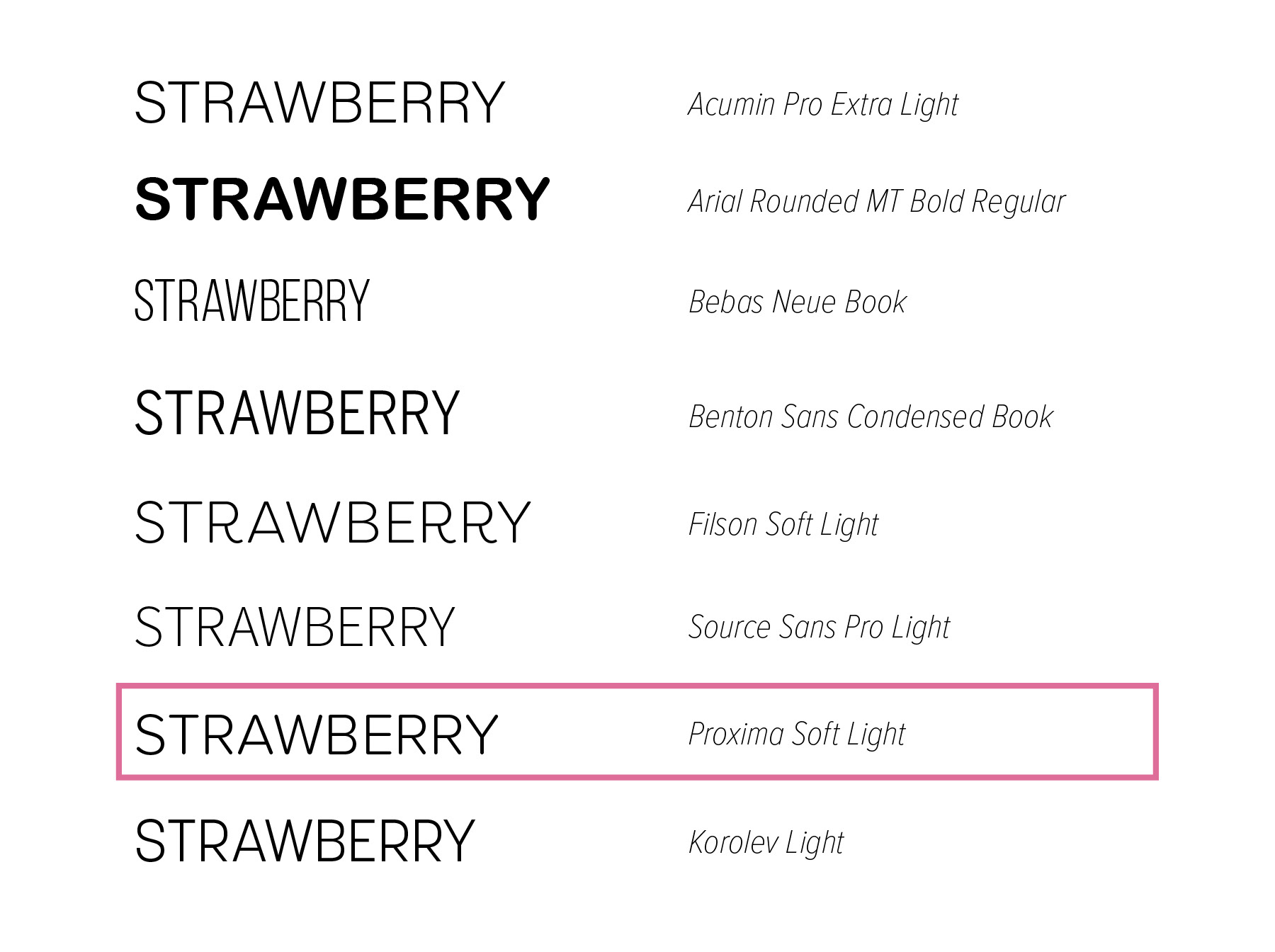
I decided on Proxima Soft as the pairing typeface because of its rounded strokes as well as having a similar counter space to the wordmark. It’s easy-to-read without taking up a lot of space, allowing the illustrations to speak to the flavor of each bar without creating too much visual noise.
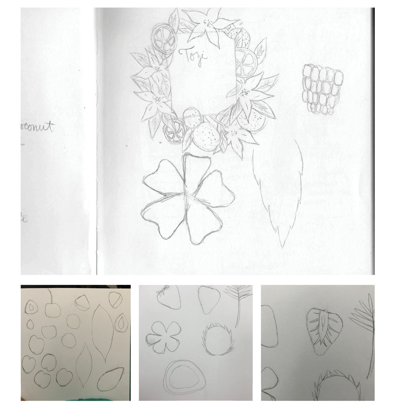
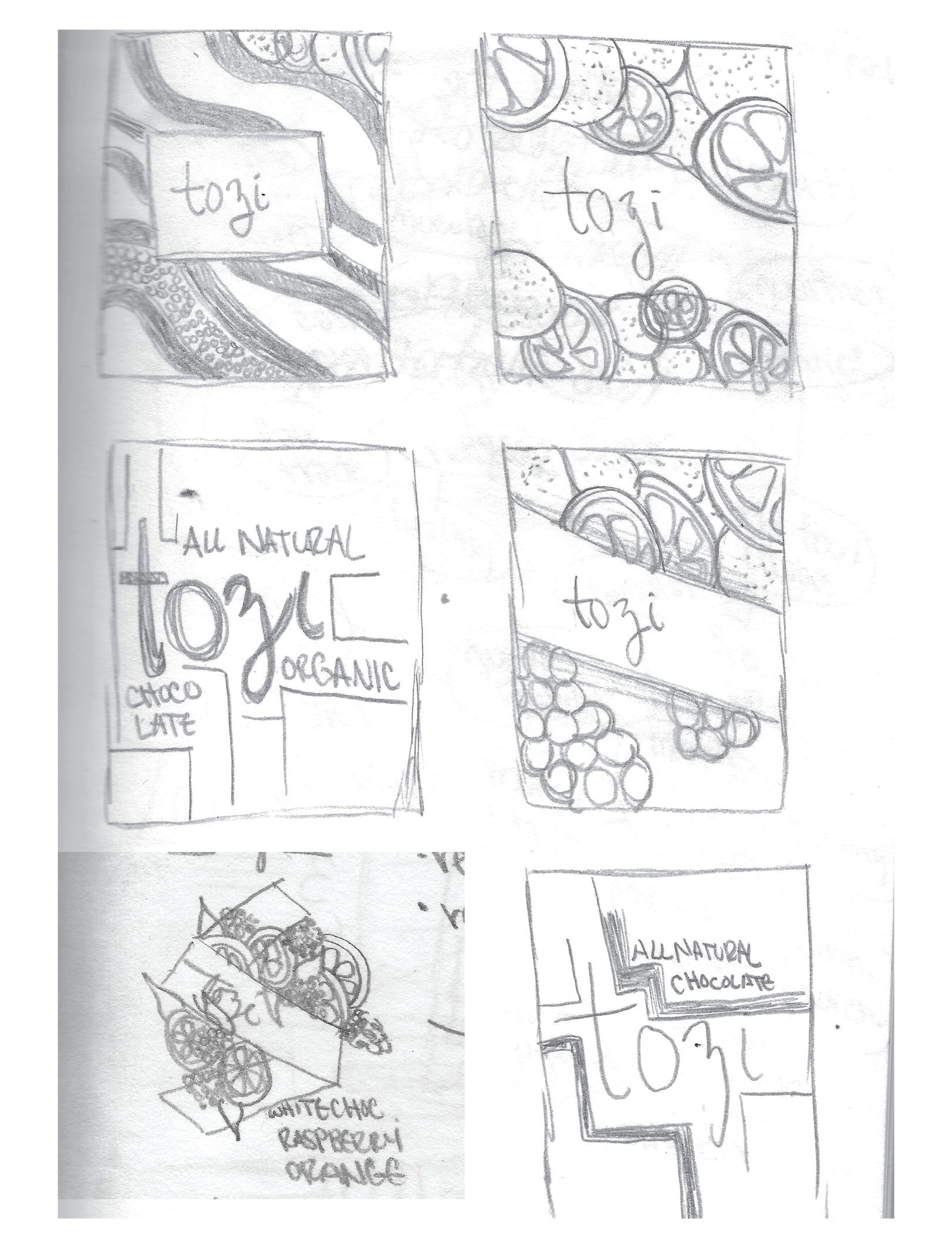
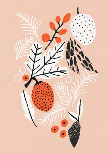
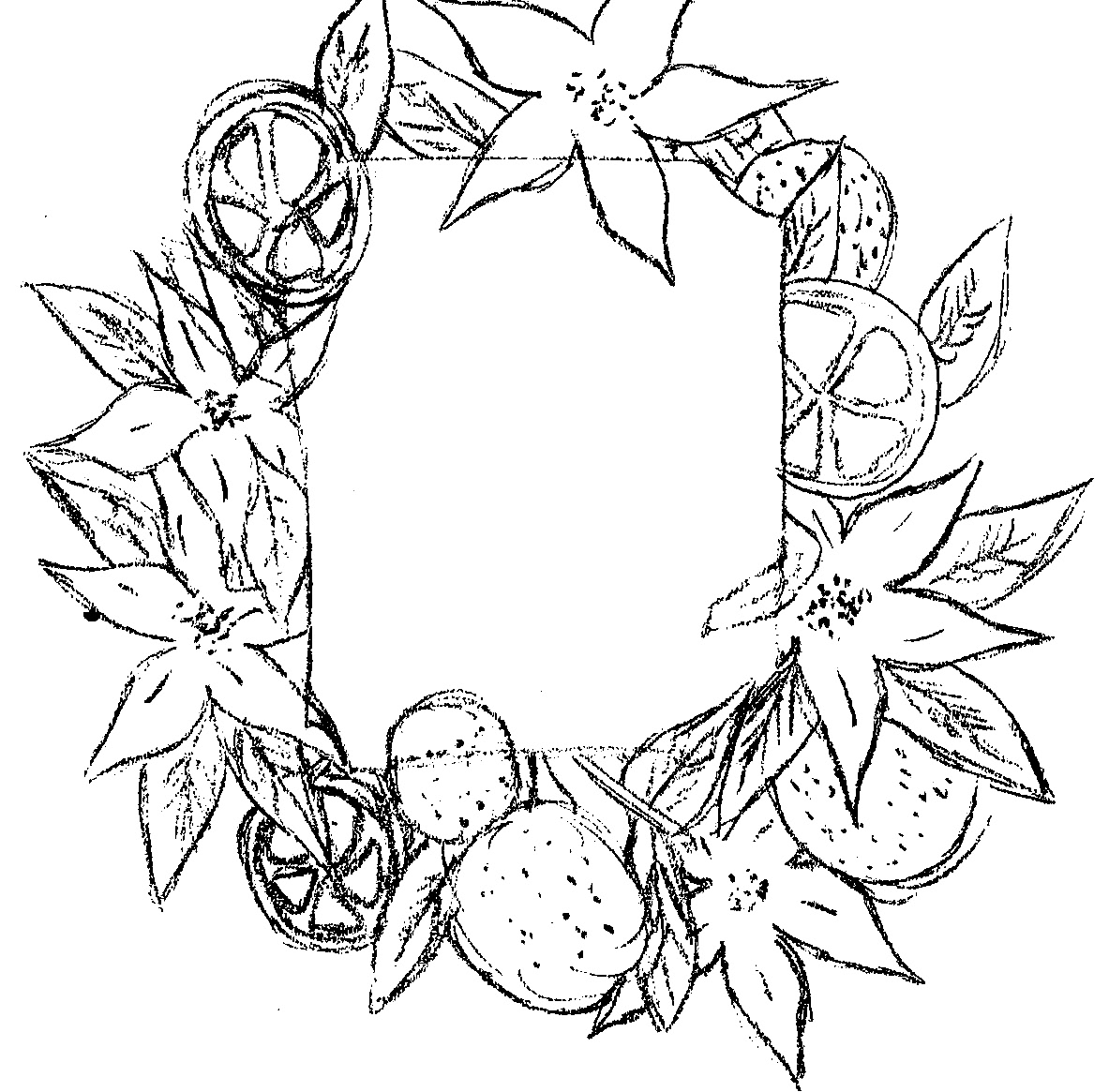
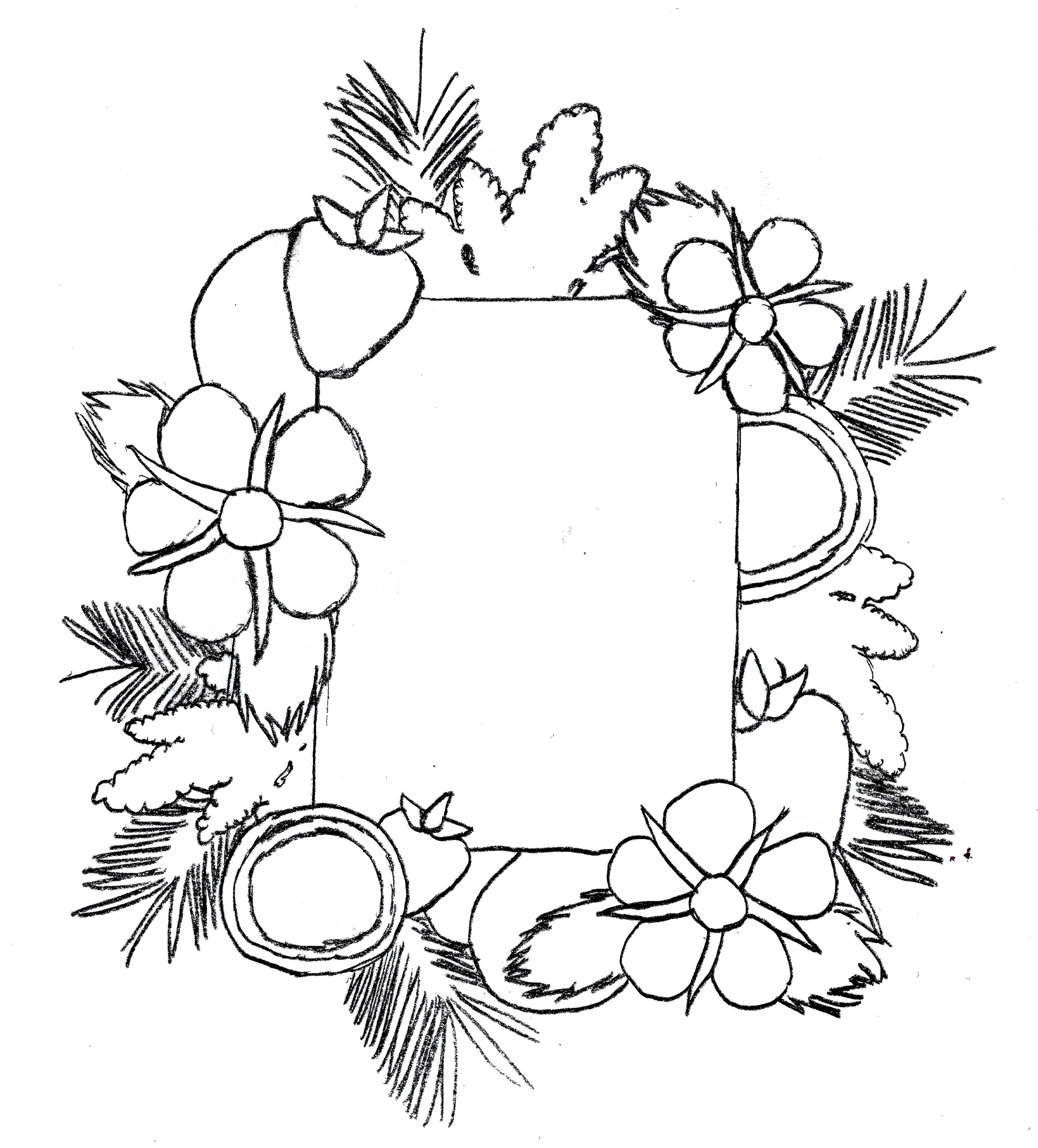
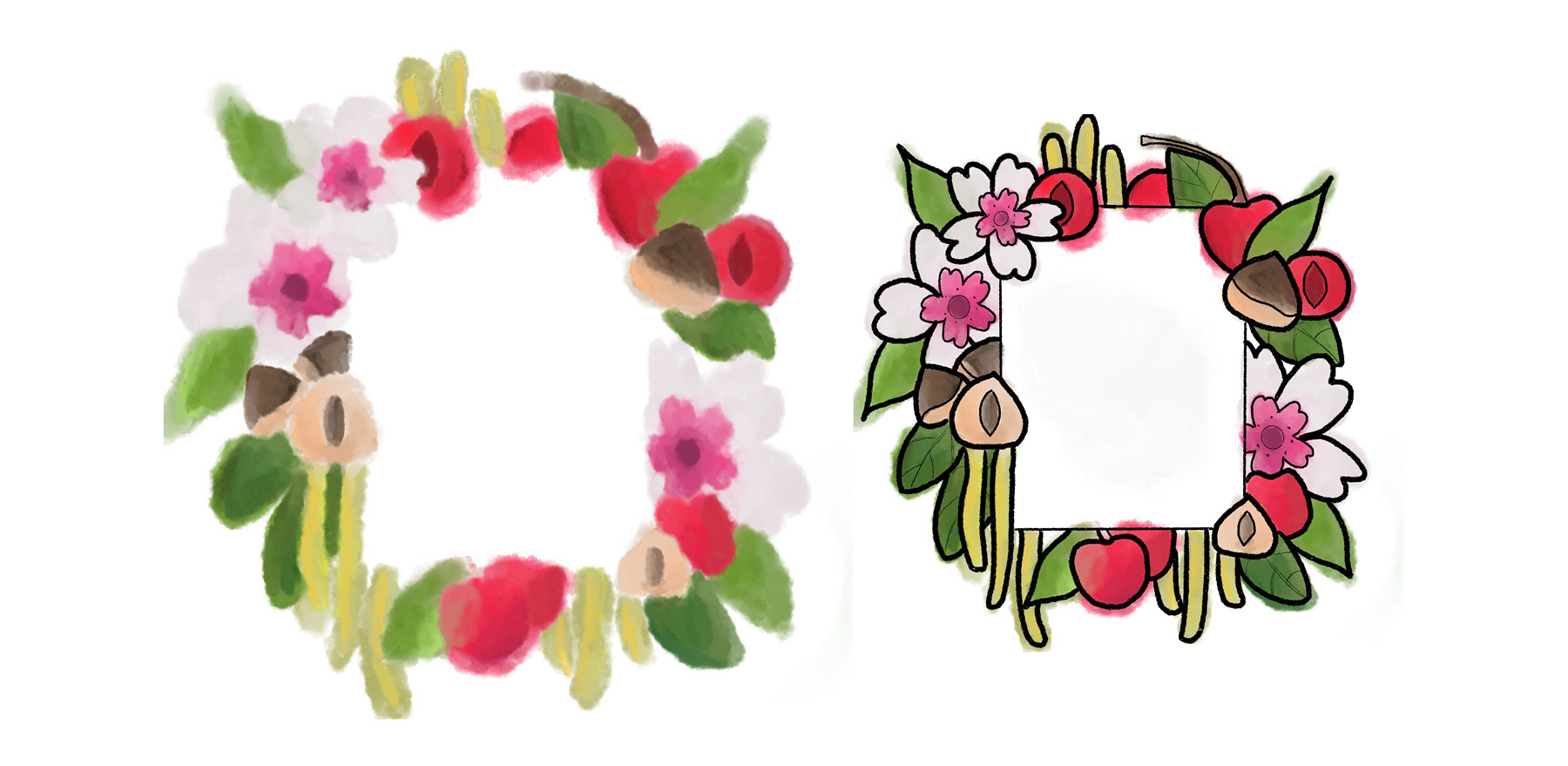
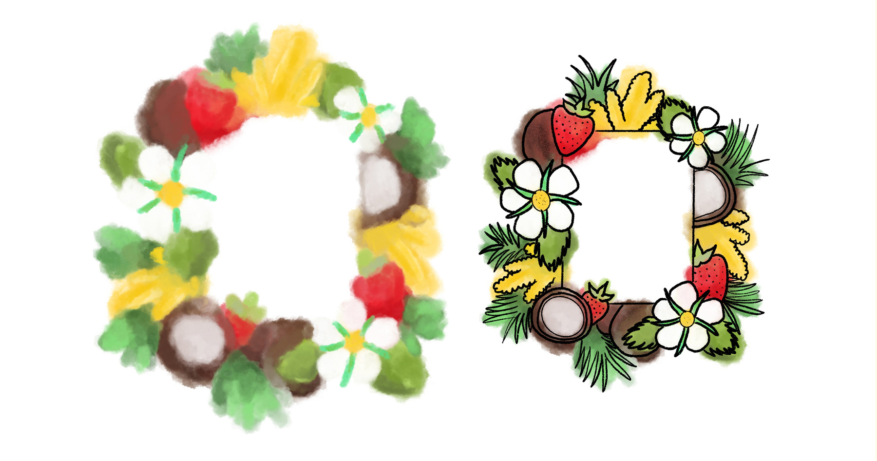
The main idea behind my initial sketches was a focus on the natural forms of the fruits that would make up the flavors. It was a motif I felt would best represent the brand of chocolate. After feedback from classmates and my instructor, I decided using a concept like the traditional botanical drawings would be the strongest route to take. The idea was the fruits and their blossoms growing around the front label of the box.
Based on feedback I decided to push the uneven lines and use bright colors. I liked the idea of blending color together, using almost a watercolor-like effect.
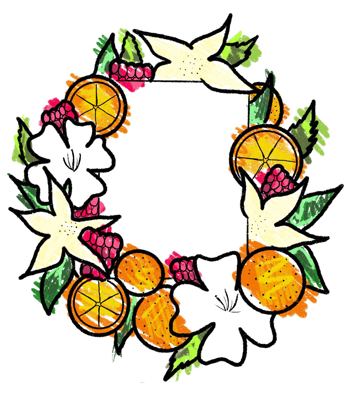
Based on the sketch on the left, I came up with the on the right idea. Washed out colors being defined only by the outline on top of them. The bold colors taken from photography of the fruits and blossoms being featured.
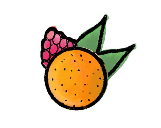
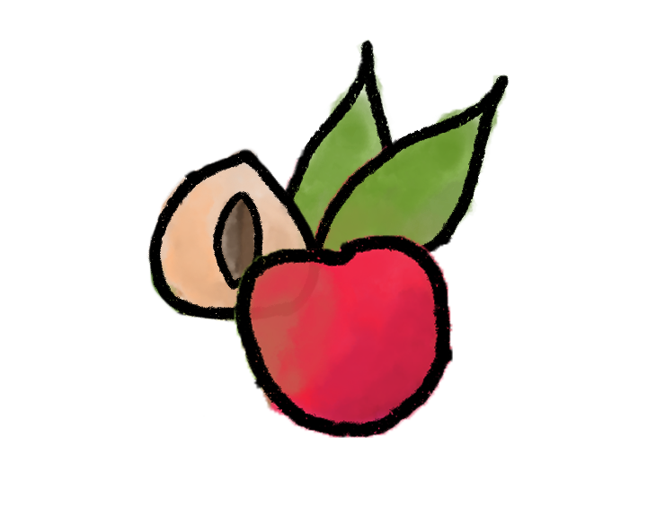
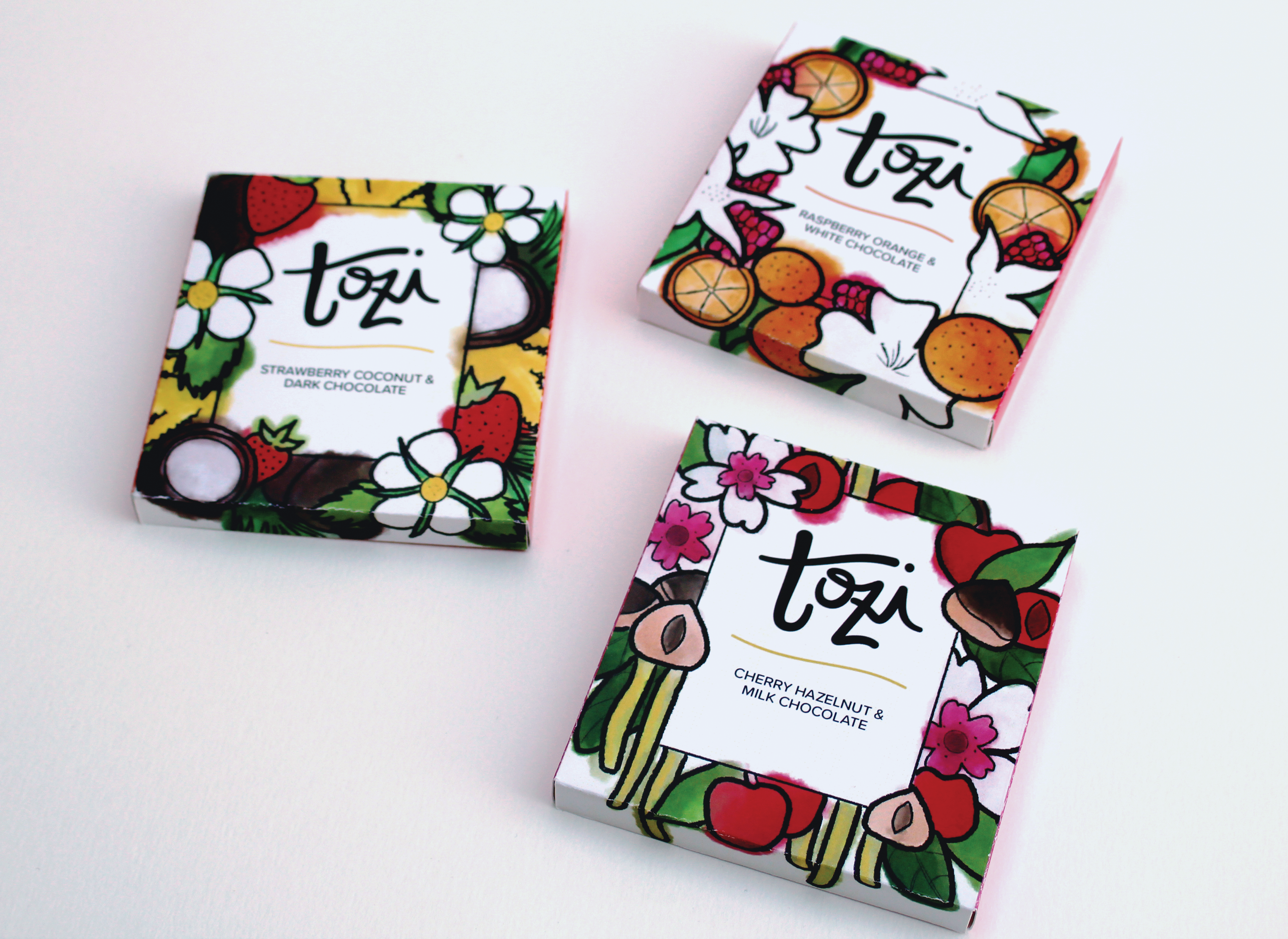
In refining the box design, I decided to use a lot of the same elements from the initial design to help tie the front to the back. This meant making fruit icons to separate the brand information from the ingredients on the back.
The final work is a series of chocolate bar boxes inspired by nature, featuring bright colors and gourmet flavor combinations.
All reference images are copyright of their original owners.