
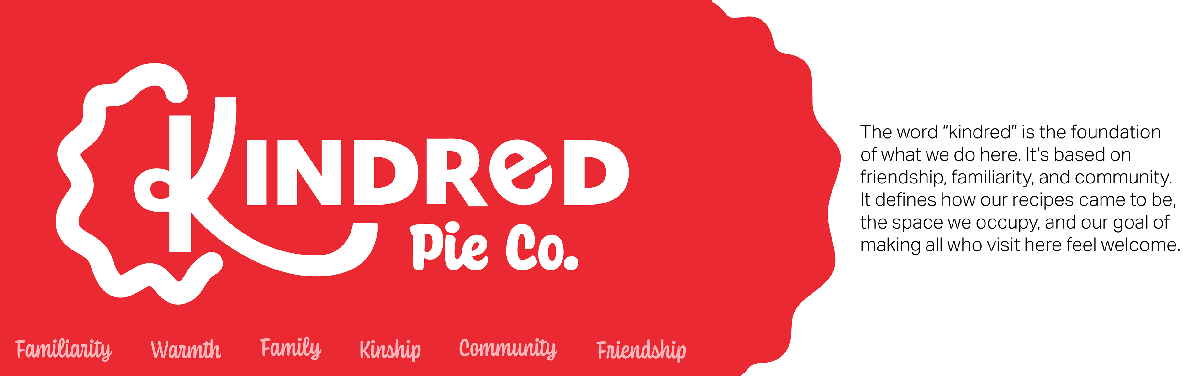
Kindred Pie Co. is a brand concept for a fictional pie company based in Vancouver, WA. Based on the phrase "as American as apple pie", Kindred is built on the memories almost everyone has of pie. Whether it be hand pies, samosas, or empanadas we all have some association with a pastry with a filling. Using this idea, Kindred is a community space where people can gather to eat pie and meet others; where tourists can have a taste of home while away.
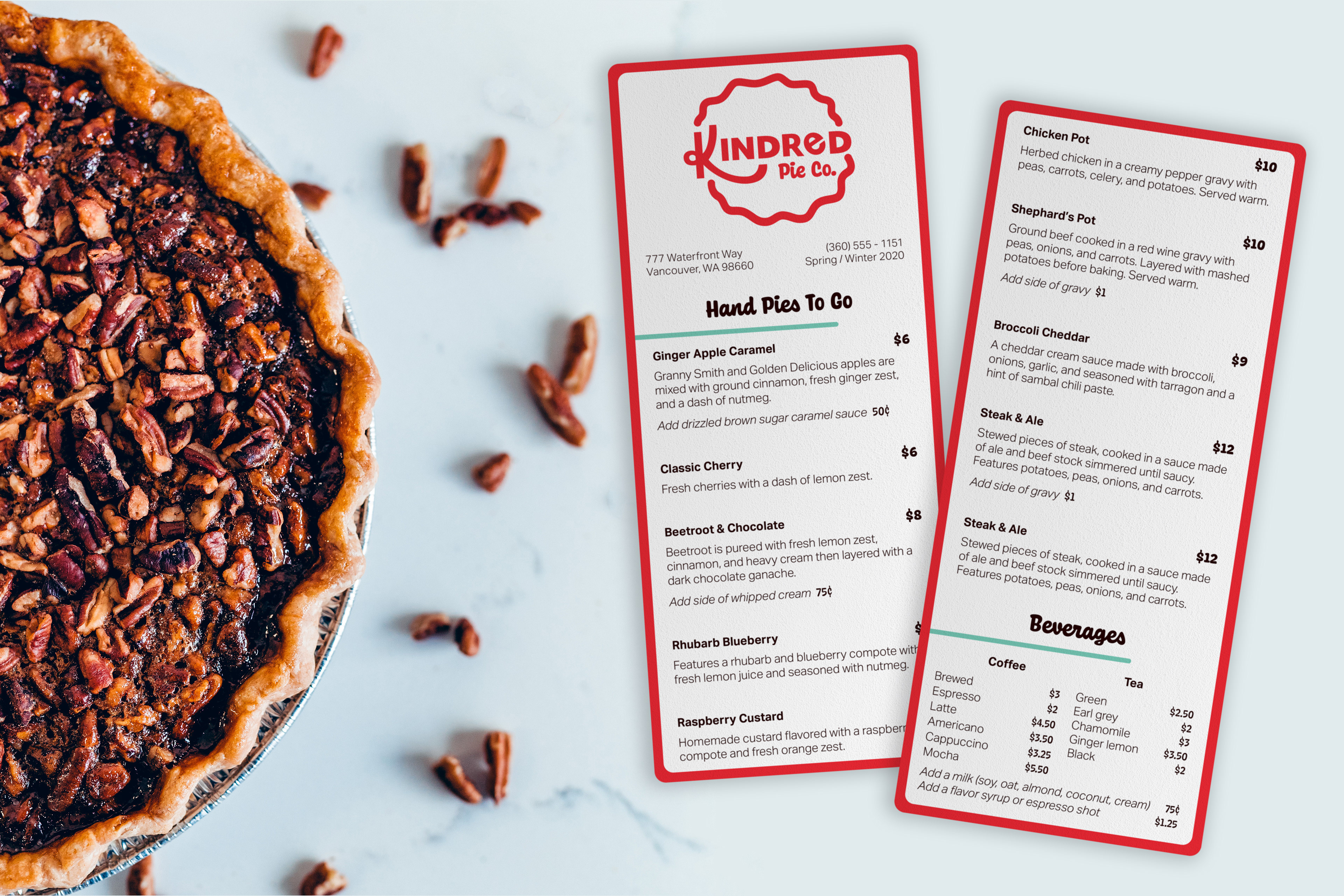
The menu is centered around what grows naturally in the area year round. With a rotating seasonal selection catered to the changing harvest, Kindred is focused on helping the local community while supporting a healthy environment. This means all items are sourced locally, when possible, including coffee and tea offerings.
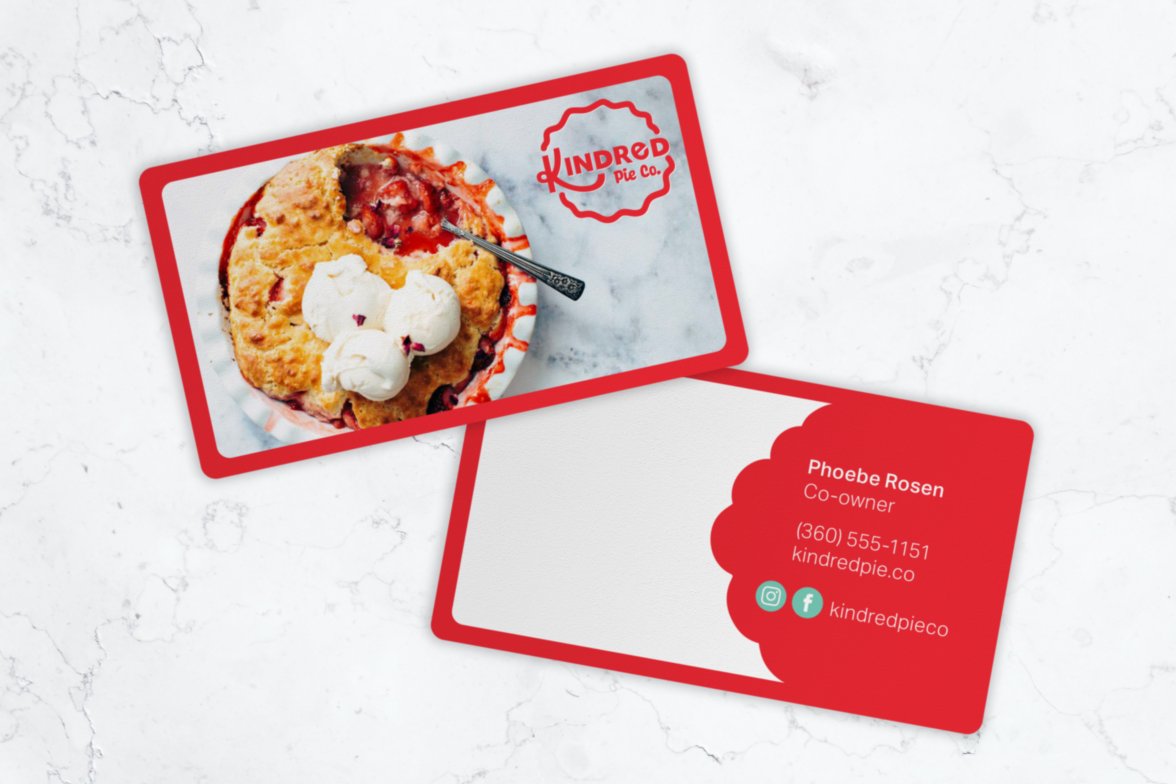
For the logos, I considered things like what kind of imagery is used in reference to bakeries, what’s notable about pie, pie-making tools, the initials for the company, and even pie itself. After lots of iterations, my own lettering style seemed to fit the “Kindred” title the most, especially when combined with the imagery of a pie crust and the typeface Coniferous. With that, the branding for Kindred Pie Co. came together.
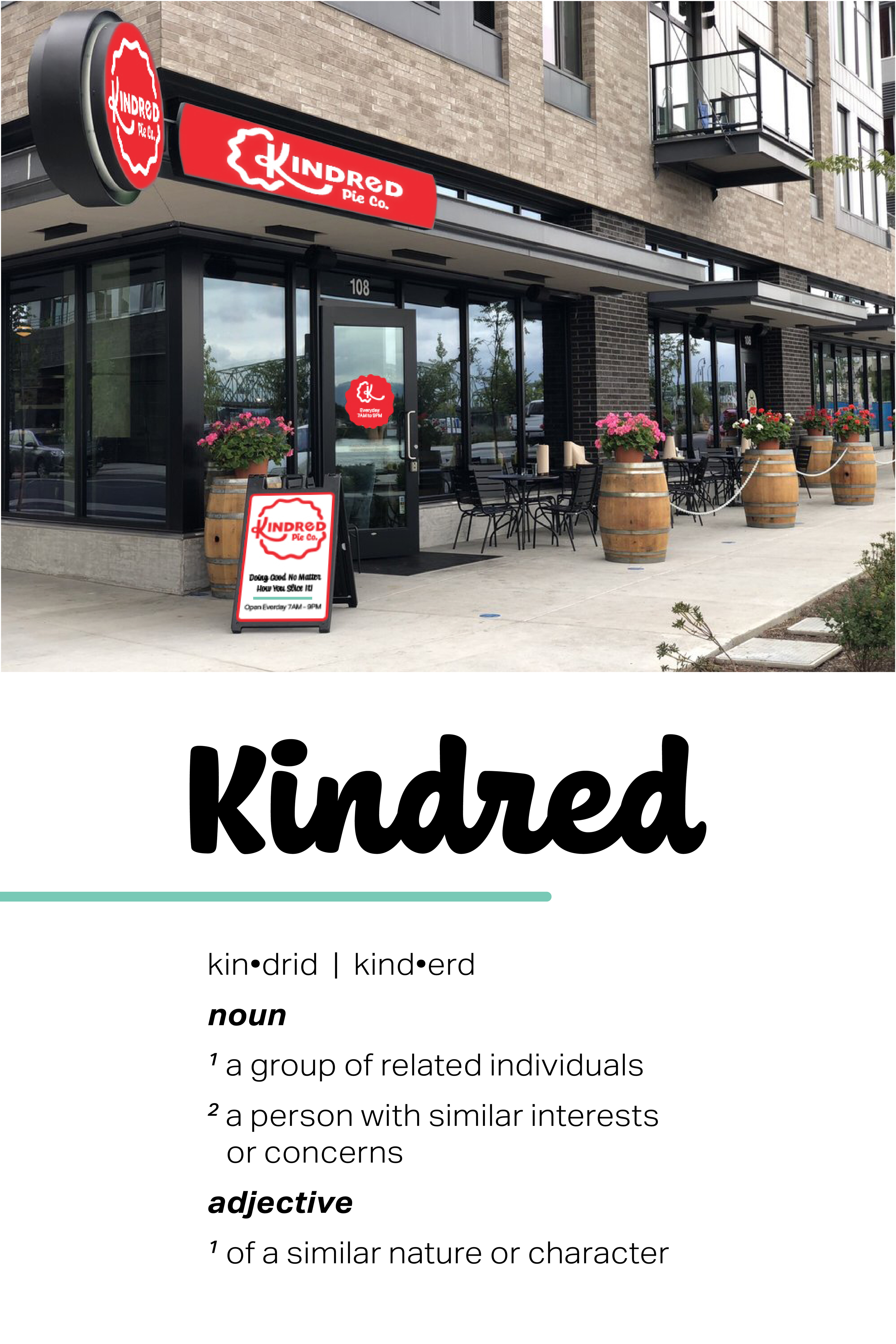
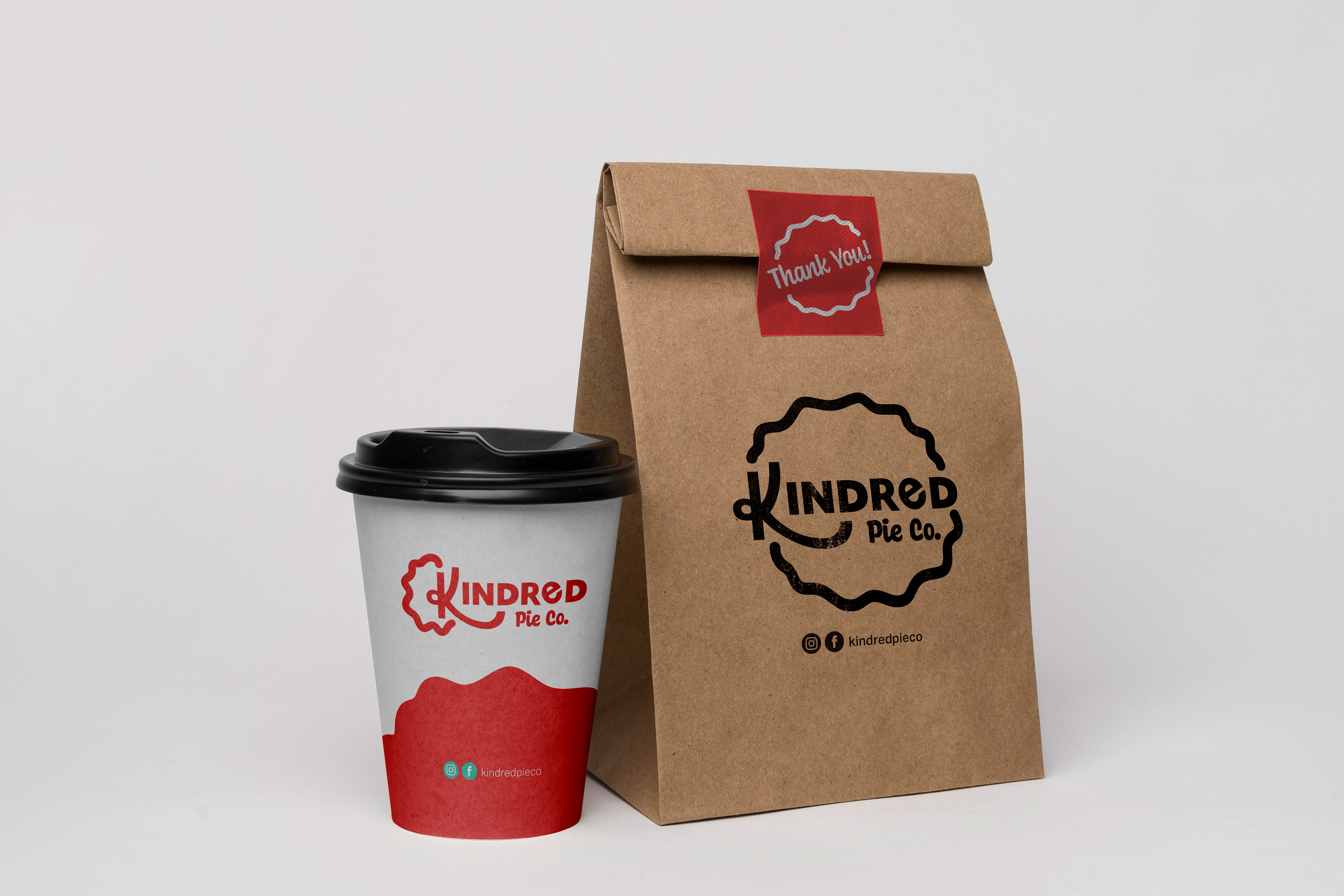
With the waterfront having gone through redevelopment recently, Kindred features a walk-up window for hand pies to go (or you can order slices for dine-in) for a little slice of home away from home. Kindred is trying to do good, no matter how you slice it!
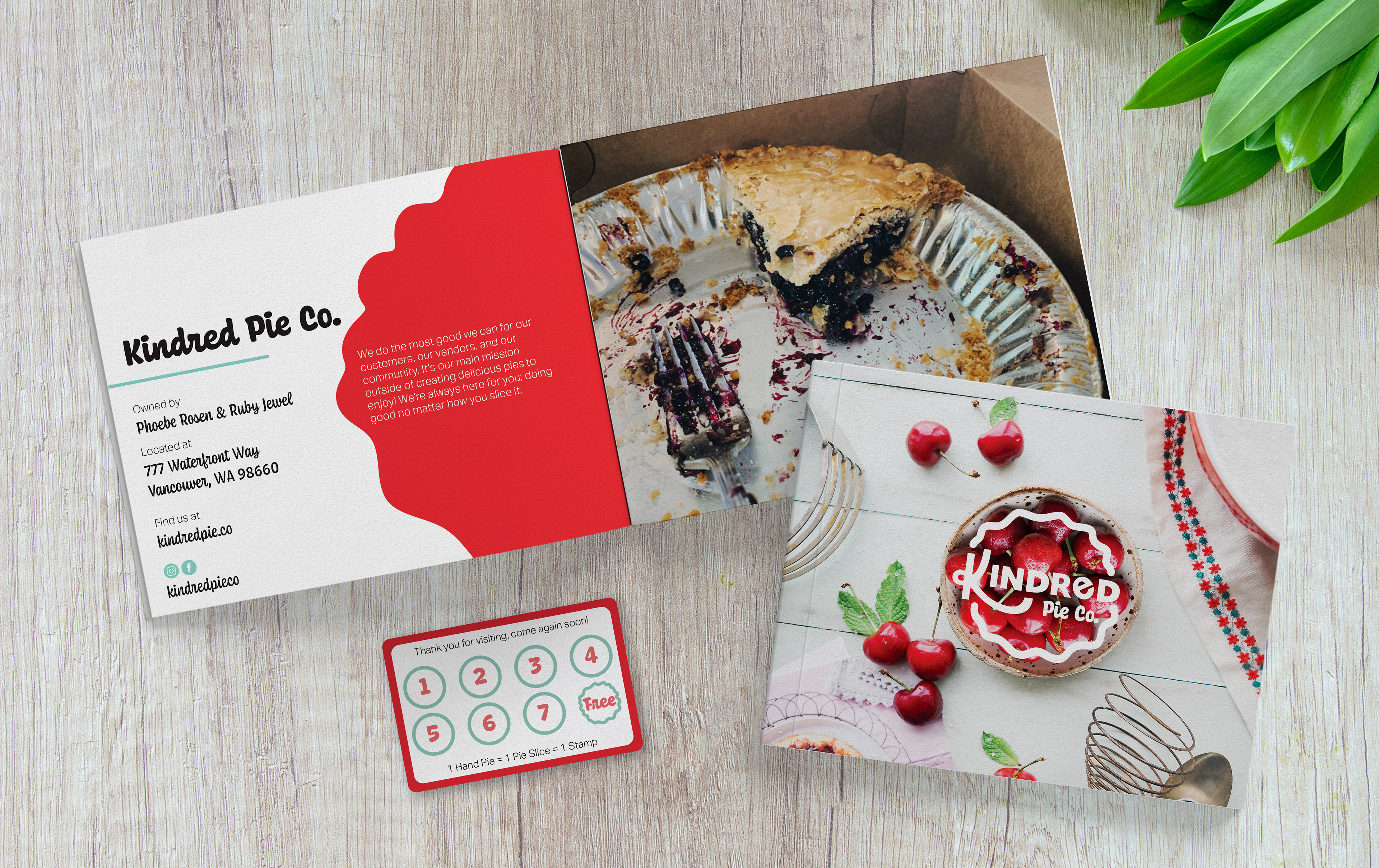
Image credits in order of appearance: